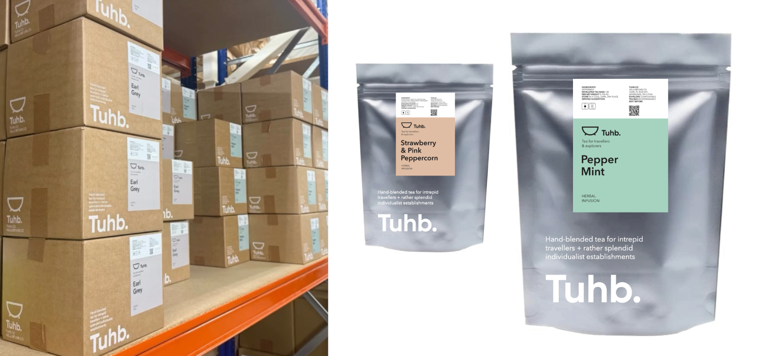
Brand creation: Brand Naming / Brand Definition / Brand Positioning / Brand Tone & Language / Brand Identity: Logotype Wordmark, Graphic Icon, Definition Of Photo Image Style, Typography, Supporting Iconography + Formalisation Into Brand Style Guides.
Our client’s business had been importing and hand-blending specialist teas for over 25 years and supplying some of the country’s most well-known high street retailers such as Fortnum & Mason.
When they wanted to create their own tea brand start-up specifically aimed at the independent boutique hotel sector they came to us in our capacity as a brand identity creation consultancy specialising in the food and beverage sector.
They wanted the product to represent their exploration of the best leaves and their navigation of the long journey from plantation to pot. And that it should also nod to tea’s position as the sustenance of choice for weary travellers throughout the ages.
A strong brand should be rooted in an incisive idea that goes to the heart of its reason for being. This will then drive everything that the business does, not only from a marketing perspective but also from an operational one.
With that in mind we realized that the one common factor shared between its core target independent boutique hotels customers is that they are all likely to have a freestanding bath. Hence our coming up with the name for the brand – Tuhb. Apart from being a subversion of ‘tub’ it’s also an acronym of ‘Tea – Unique House Blends’.
This naming approach fits with a positioning of being a contemporary tea company rather than a traditional one. In effect we were travelling in the opposite direction from most tea companies, who tend to employ traditional and heritage based brand identity cues. Thus, the name lead to the development of the simple tub graphic icon.
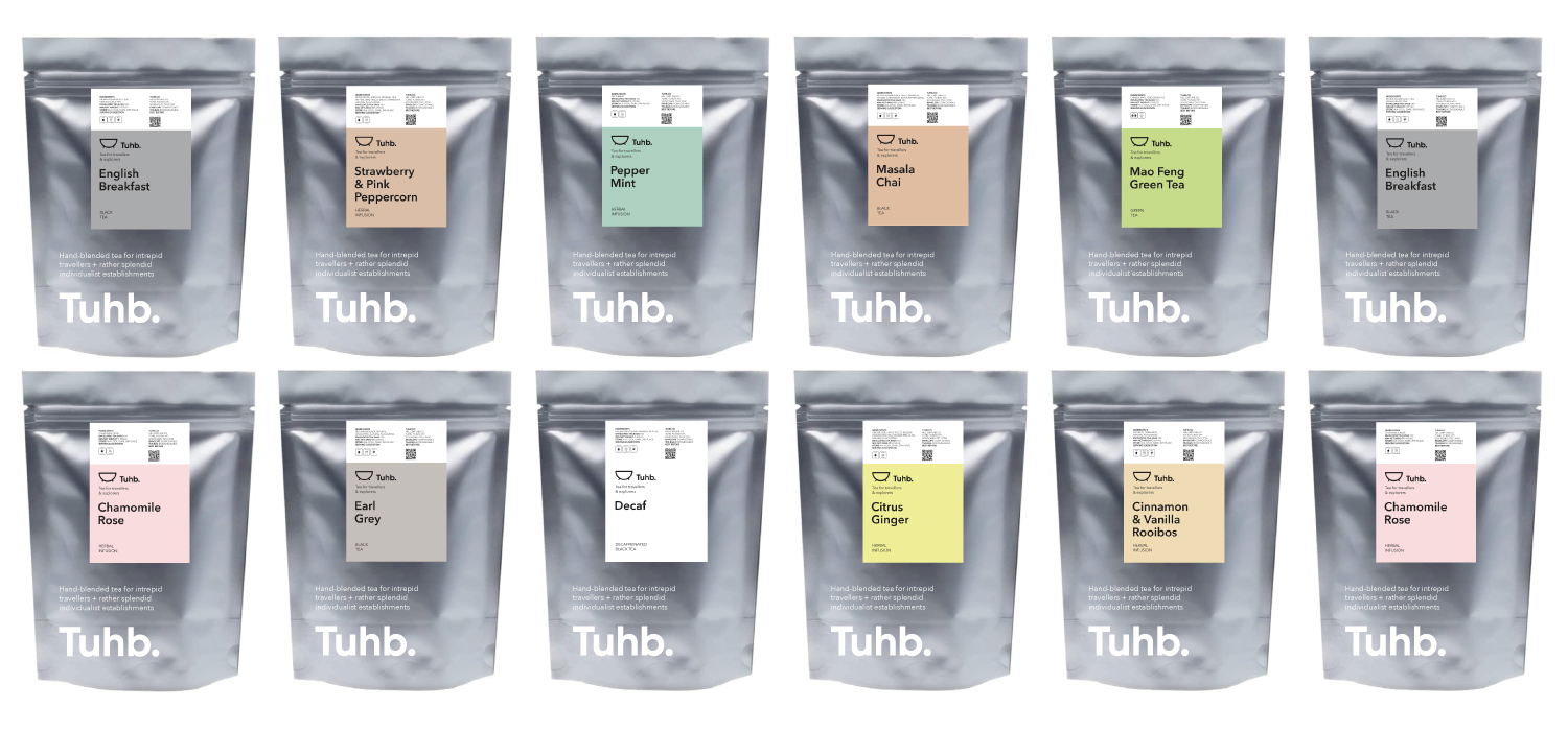
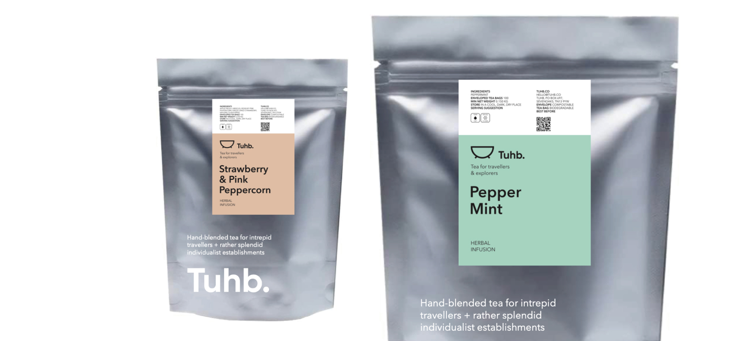
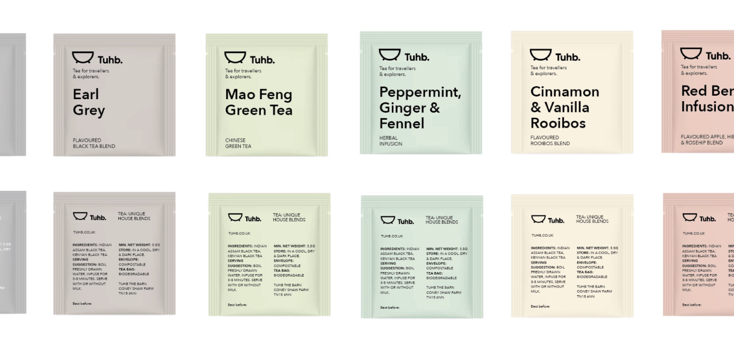
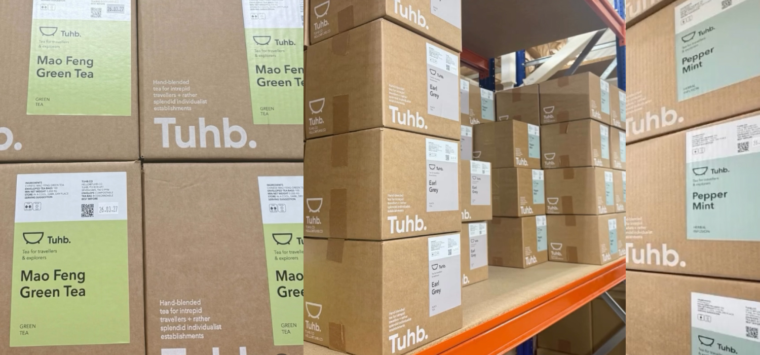
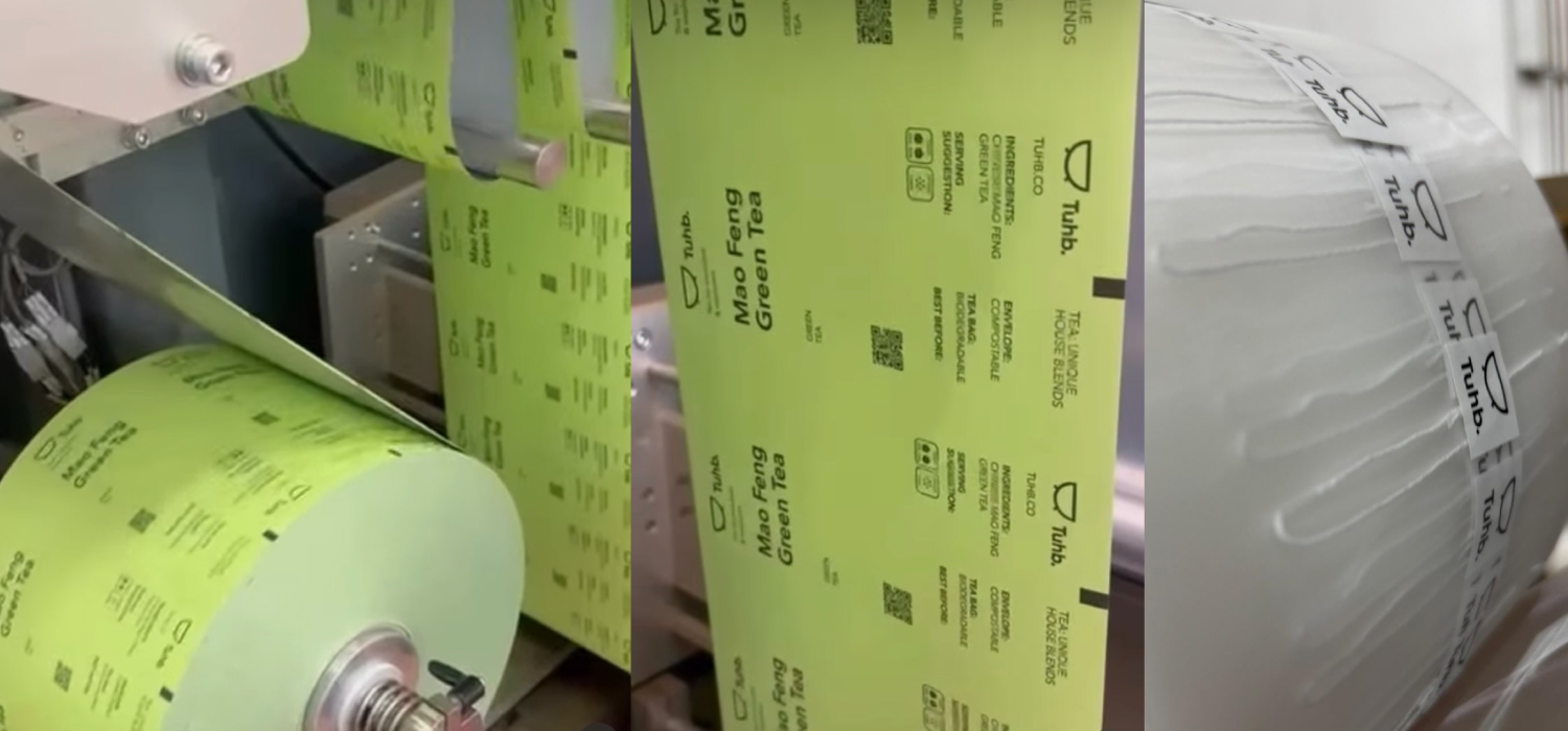
At the other end of the challenge is that they offer multiple tea blends, often in small batches and with new ones being developed all the time. Our packaging design solution is therefore conceived to be flexible in order to allow them to do this – a branded generic pouch concept that is over-layed with colour-differentiated individual labels.
