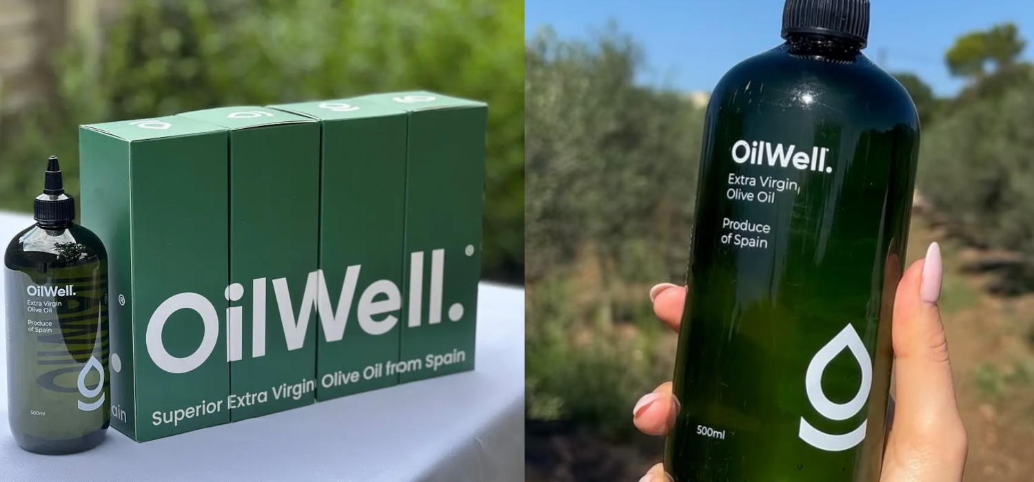
Brand creation: Brand Naming / Brand Definition / Brand Positioning / Brand Tone & Language / Brand Identity: Logotype Wordmark, Graphic Icon, Definition Of Photo Image Style, Typography, Supporting Iconography + Formalisation Into Brand Style Guides.

Creating a powerful brand starts with the name. It’s perhaps the most demanding part of a brand creation project. That’s because anything that’s obvious is probably already being used by someone else. It was a lot easier 20 years ago.
This was the initial challenge when our client approached us – in our capacity as brand creation experts for start-ups in the food and beverage sector – to create their new olive oil brand. In fact they had another name in mind completely: Squeezy – because it was descriptive of its plastic bottle.
We felt that creating a brand around what was after all a generic packaging style, whilst perhaps useful in the short term – when this type of packaging is a novelty in relation to traditional glass bottles – would mean potentially limiting their differentiation in the long term. For example, the marketplace is already starting to adopt this type of packaging – indeed M&S has just brought out a really striking own range olive oil in a vibrant yellow green squeezy bottle.
No, we wanted to go for another naming route entirely. One that would give the new brand both real on-shelf stand-out and would also allude to its brand values.
Oilwell was the name that we came up with as part of our role as brand and identity creation consultants. Both descriptive and with a double meaning word play.
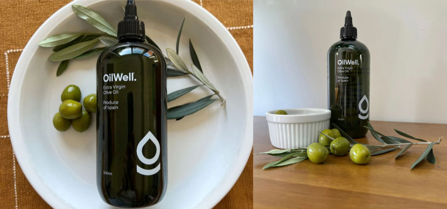
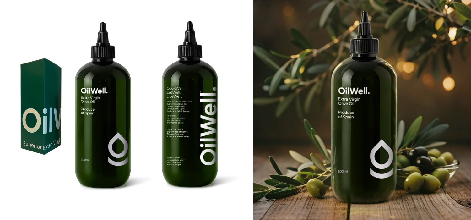
The logo design was kept simple – minimal and contemporary. This would allow the bottle to use simple striking typography rather than additional design elements – such as tertiary level patterns – in order to stand out.
The identity system that we developed was subsequently applied to outer packaging and online applications including website and social media.