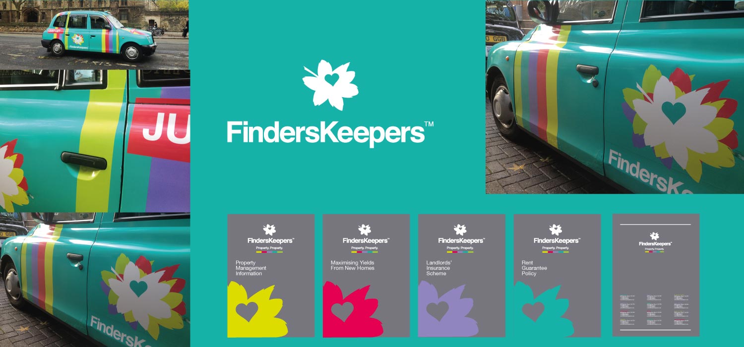
One of the projects that we are most often approached about is our root and branch rebrand of the multi Sunday Times award winning FindersKeepers. It has been a major success and has pretty much exceeding all the client’s hopes and expectations. In 2011 we were asked to formulate a plan that would reinforce and expand the market position of Oxfordshire’s largest independent property agency business as it fronted up to its national high street chain agency competitors. “Make us into a sharp instrument rather than a blunt tool” was the thrust of the brief from Dan Channer, the group’s marketing director.
In short, our solution uses colour strategically. We took ownership of vibrant hues and applied them to everything from property boards to agency shop fascias and vehicles to fully wrapped taxis. The result, according to commissioned post roll-out target audience research, was massively increased perceived critical mass – “FindersKeepers seems to be everywhere”. As mentioned, a particularly unusual and interesting aspect of the branding project was to use 5 different colour lettings boards in order to reflect its independent, young and fresh positioning. We were subsequently asked back to refresh the brand again in late 2015 when we made a series of significant but subtle changes that will keep the 9 office business at the forefront of the market.
Work Programme Undertaken Includes: Brand Definition / Brand Positioning / Brand Identity & Guidelines / Brand Implementation / Branch Interior Design / External Signage & Graphics / Lettings Boards / Literature / Advertising / Website Design / Vehicles / Stationery.


