Brand identity design consultants specialising in working with artisanal brands, entrepreneurs & business start-ups
London / Gloucestershire / Oxfordshire / Warwickshire
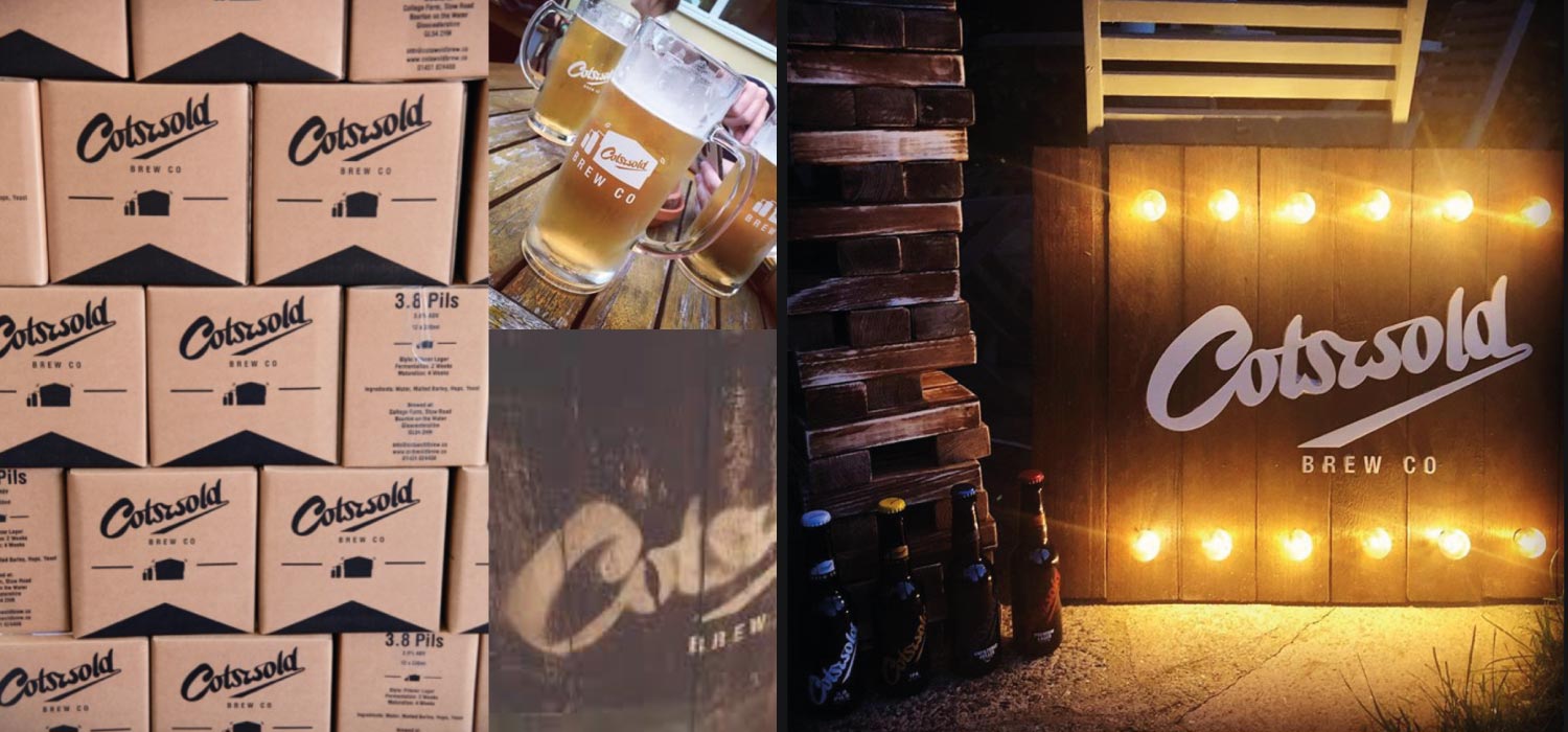
Brand Identity Consultancy
Corporate Identity Consultancy
© Zut Alors Productions Ltd 2026 Brand Definition, Creation & Implementation
New Product Branding
Brand Identity Development
Logo Design
Brand Personality
Brand Language
Personal Brand Identity
Graphic Design
Cost Effective Brand Creation
The Common Sense Way To Create A Brand
Terms Of Use Privacy Policy