Rebrand Creation: Brand Definition / Brand Positioning / Brand Tone & Language / Brand Identity: Logotype Wordmark, Graphic Icon, Definition Of Photo Image Style, Typography, Supporting Iconography + Formalisation Into Brand Style Guides.
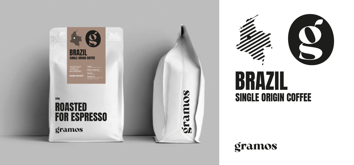
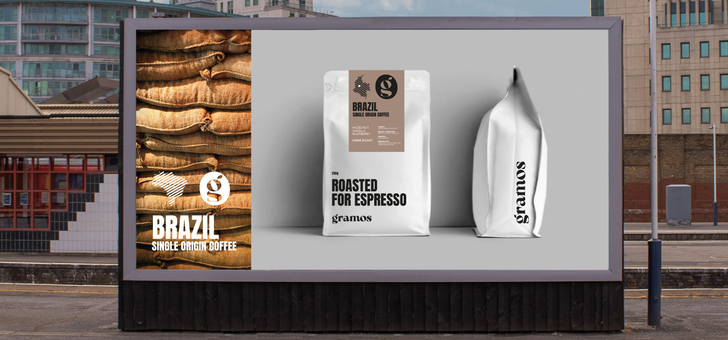
We always say that we make our clients look like they’ve spent £100k when in fact they’ve only spent a fraction of that.
If you’re in the process of thinking about your brand and you’d like to know more please get in touch.
paul@zutalors.design

Part of that brief was to reposition it towards a younger core demographic. University students being a particular important audience.
The Solution
Pulled came to us due to our specialism in brand identity creation for brand start-ups in the food and beverage sector. We worked together to define a solution that involved not only the way that it is presented but also the product itself. The menu was significantly simplified: down to to two core products, priced competitively and pitched in a street food to-go style.
This is classic vertical sectoring. In other words, we set out to become ‘the place for pulled pork street food in northern Italy’.
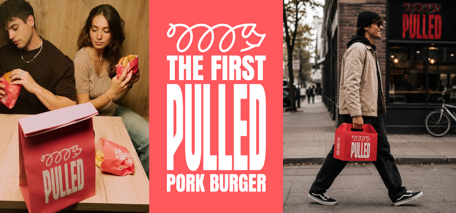
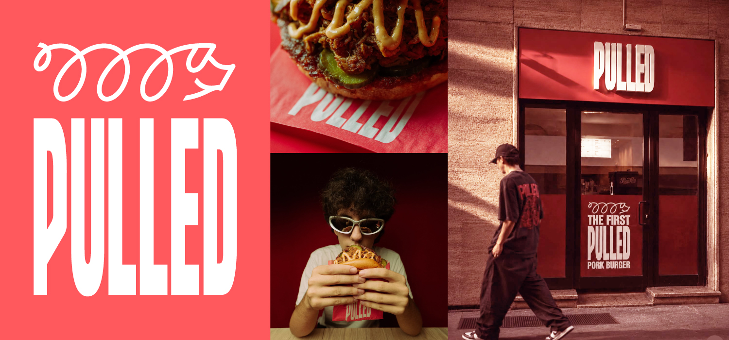
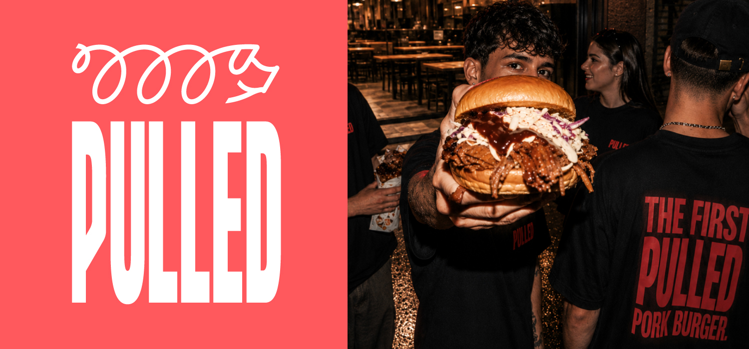
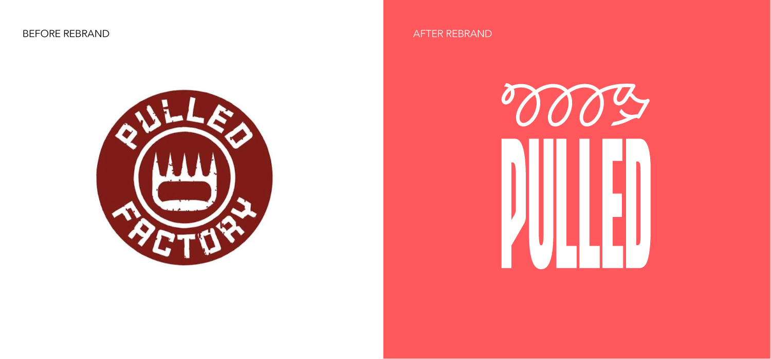
To reinforce this proposition we shortened the name from Pulled Factory to simply Pulled and we introduced a logotype that reflects the combed pulling sequence that is used to create the product. We combined it with a striking colour, thus ensuring category ownership moving forward, plus high visibility on street: both in terms of shop frontages and also the packaging. Finally we developed the ‘Squiggle-Piggy’ icon to bring in additional personality to the brand.
Thus Pulled employs a triumvirate of core brand identity elements: wordmark, colour and icon.
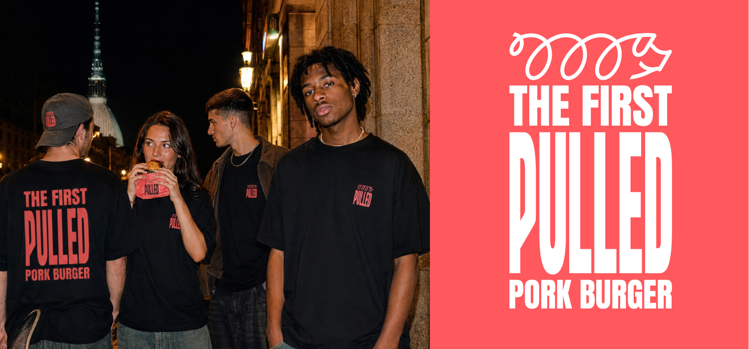
Food bags were designed purposely as part of the brand advertising & influencing programme – to be carried around the streets of Turin and Milan and into university campuses by its hip young customers. This is backed up by an integrated ongoing social media campaign.
The key elements of the brand programme that we created for Pulled can thus be broken down into two areas. Firstly, the brand’s strategic proposition – brand vision & mission; brand tone & story; brand identity. Secondly, the brand’s tactical implementation programme – which covered design of packaging & branded clothing, store design and also the overall look and feel for its online presence (both social media and website).
A simple photoshoot was also undertaken – using real customers – in order to bring all the brand elements to life: in a real, urban, street food style that reinforces the authenticity of both the brand and the product.


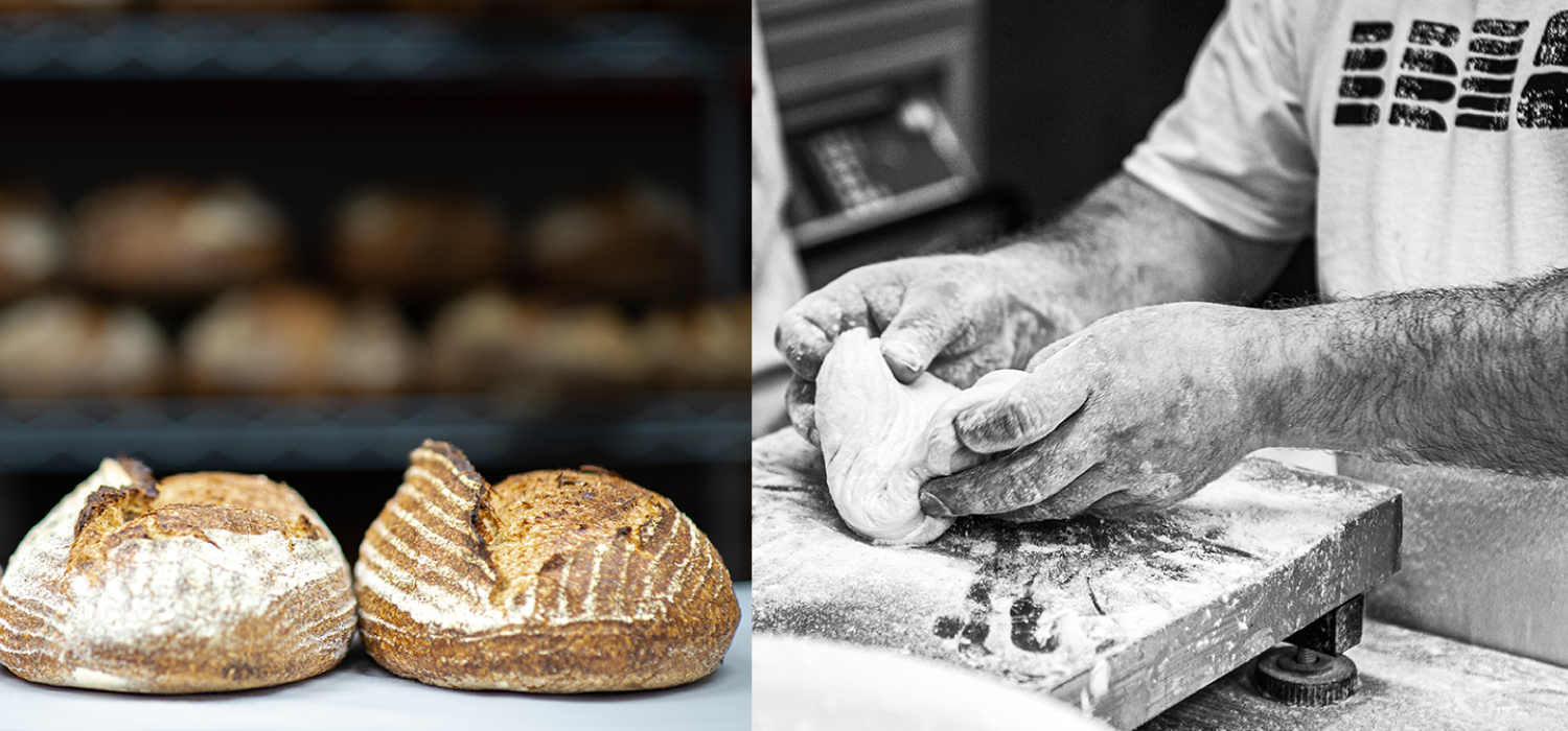
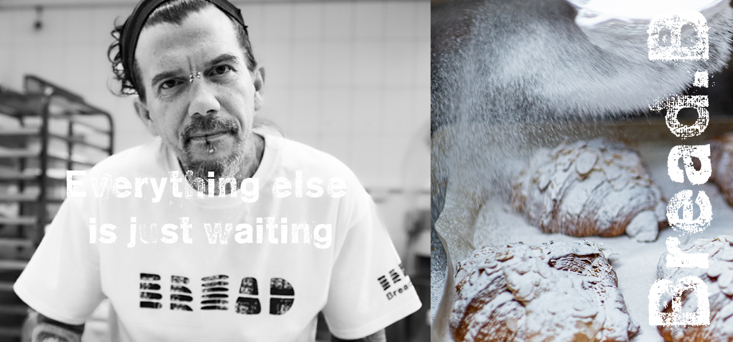
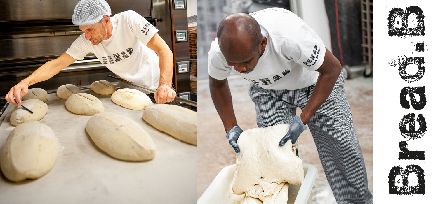
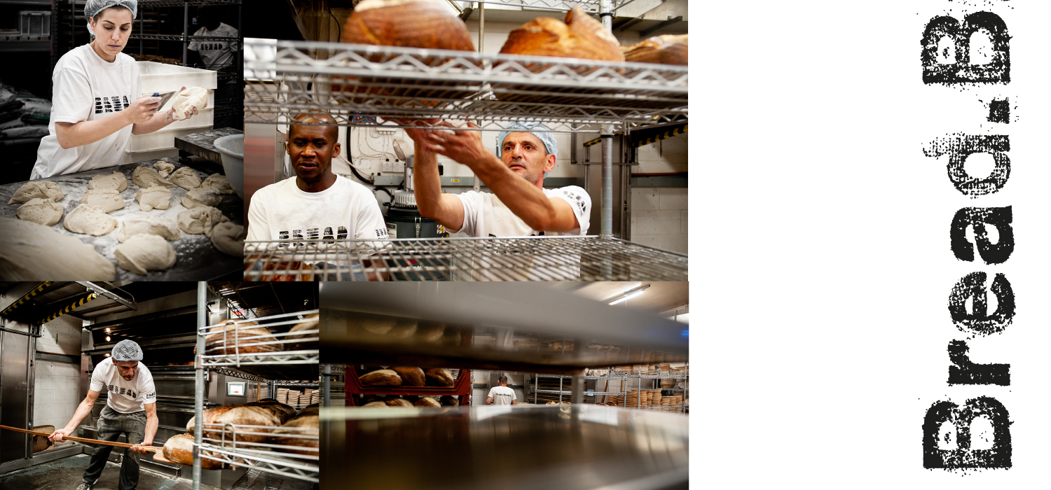

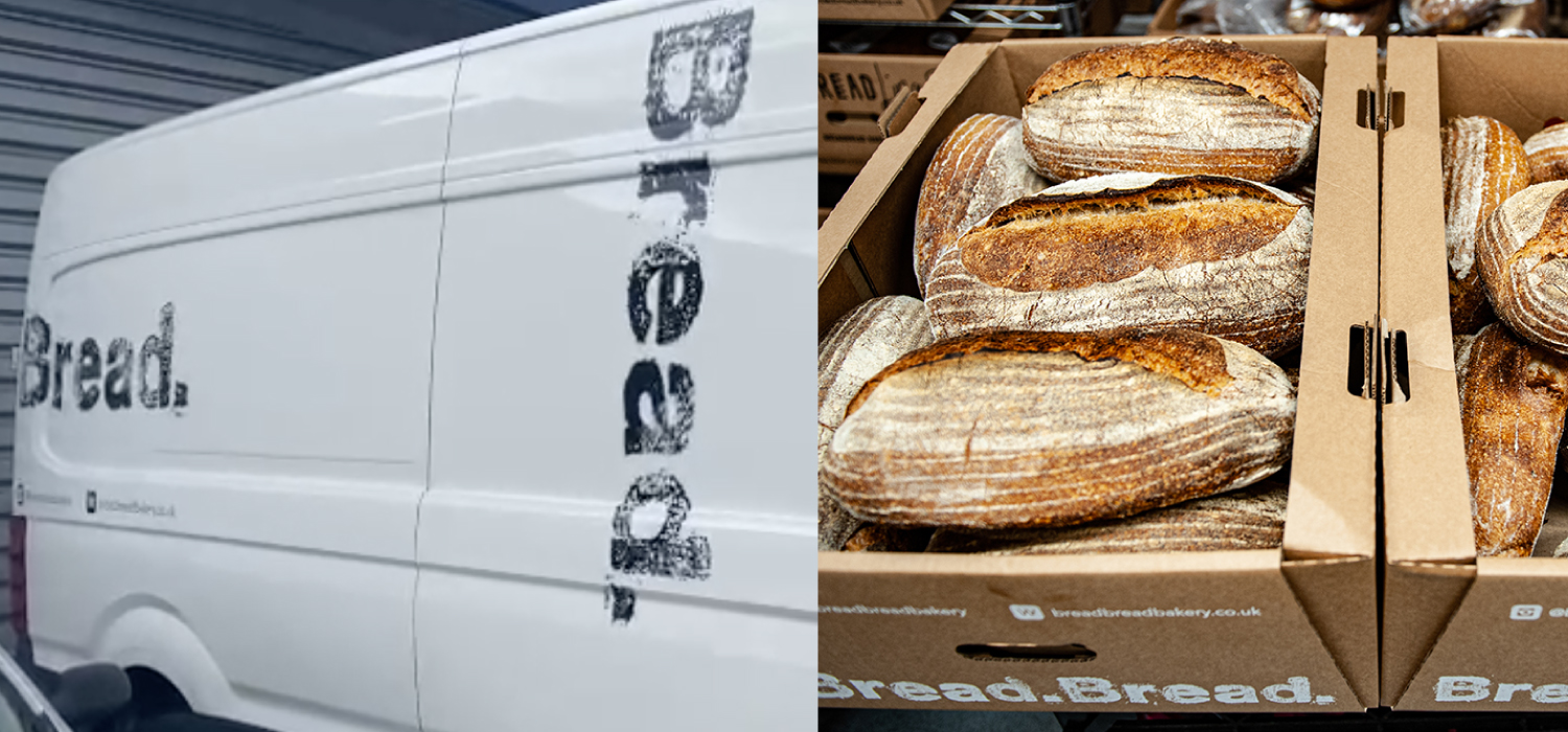


The business was established by Bridget Hugo after selling her stake as one of the two founders of the Franco Manca pizza chain. It was doing ok, but not great and needed a brand boost.
The challenge was how do you take a small bakery and give it a presence that will get it on the radars of a highly sophisticated, highly brand literate and well catered for (pardon the pun!) customer in London’s Zone 2 & 3 urban villages?
What could the brand bring the customer that a Bread Ahead or an Ole & Steen couldn’t?
Well firstly we should say that BreadBread has a good product. So a good starting point. But it simply wasn’t cutting-through. Now there’s very few silver bullet solutions out there. It’s generally just a question of doing everything as well as it can possibly be done. And that’s exactly what we did.
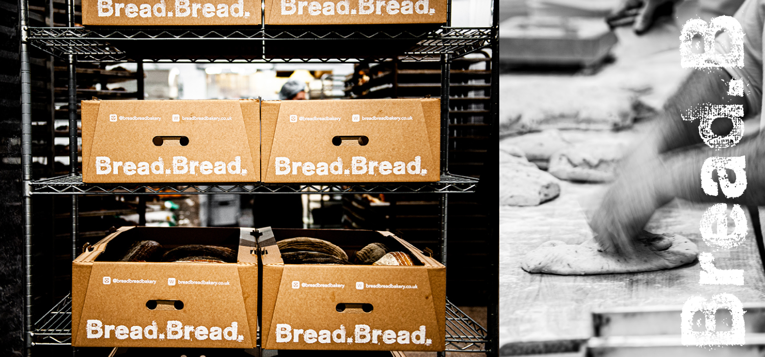
What we wanted to do with the branding was to make a very real connection between the product and the customer. And to make that connection run through every aspect of BreadBread’s communications. We set out to create a visual narrative. A visual identity system that is rooted in the product itself.
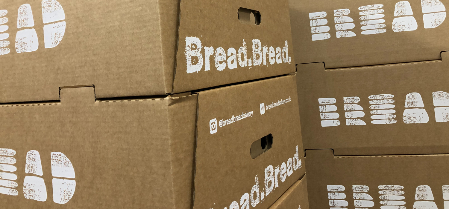
Well, fundamentally, this product is all about the provenance of the flour and the physical efforts of the bakers who turn it into bread. So when you look at the logo, or indeed, the supporting typography system you see flour. A simple solution but one that goes to the core of a business.
We then took the brand identity that we created and designed all of BreadBread’s supportingcollateral – from vehicles to packaging, clothing to signage, documents through to online.
The result is that its unprompted awareness with its London village target customer has jumped dramatically and sales are up. Dramatically so.


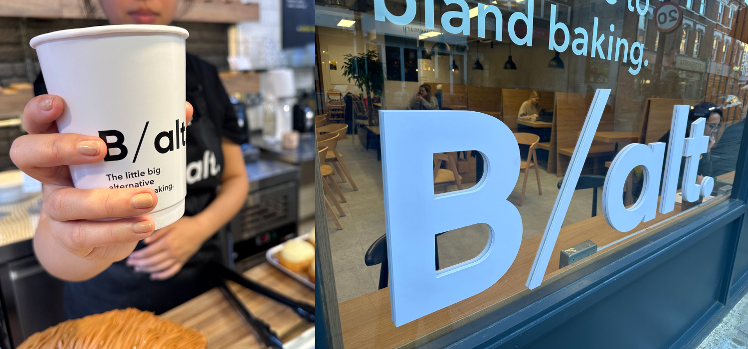
Also Interior Design, Furniture Design, Lighting Design.
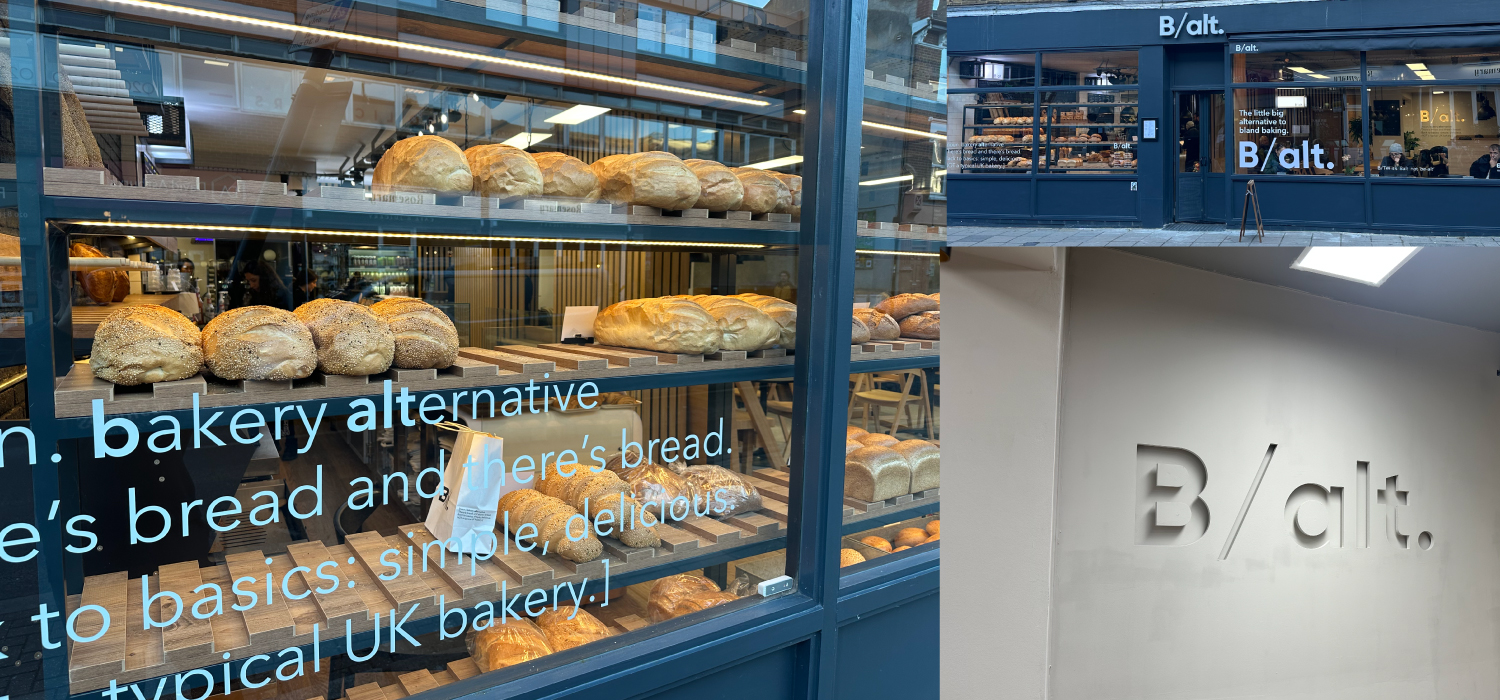


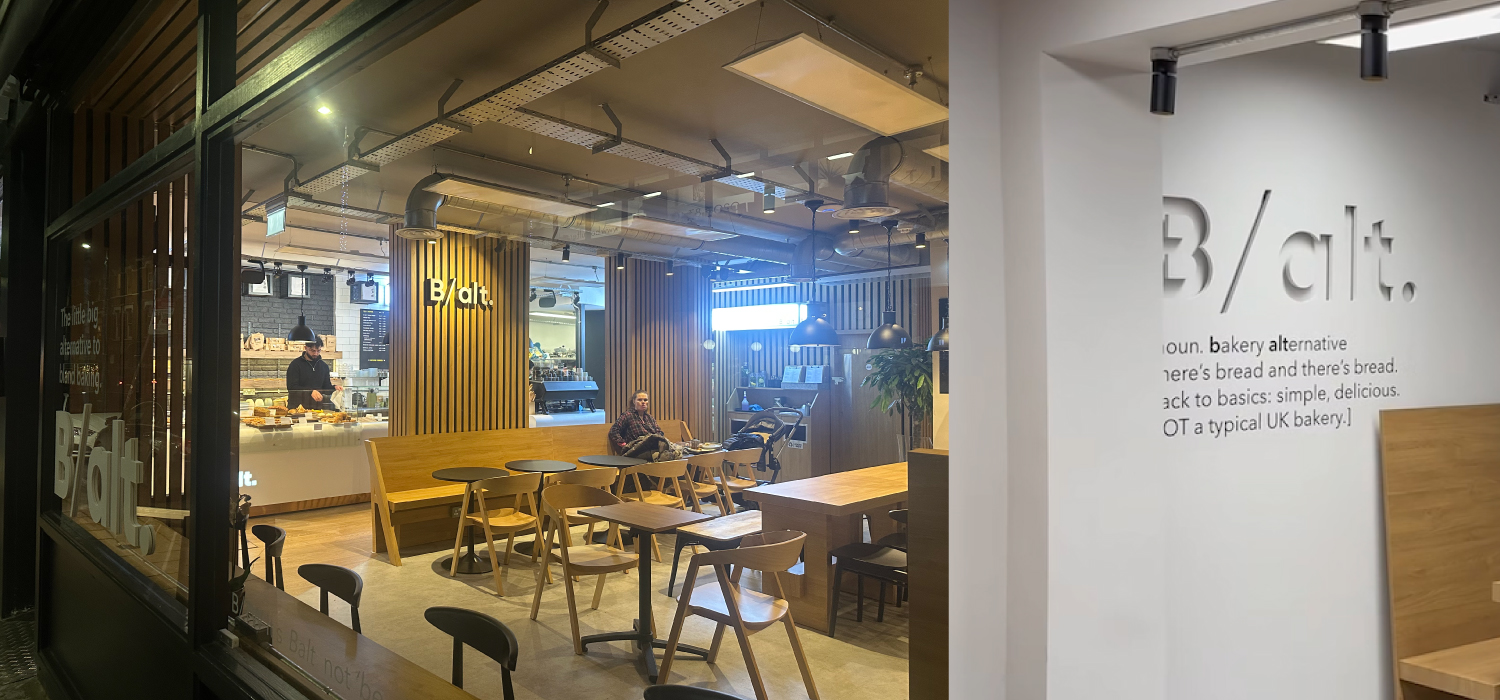

The client wanted to utilize the benefits of a central bakery and create the platform to roll-out multiple outlets around London’s Zone 2 & 3 – it’s affluent London villages outside of the West End: Marylebone, Primrose Hill, Hampstead, Barnes etc. In other words where people actually live. The target audience was therefore very brand literate and sophisticated in their likes. They’re also quite open minded to the next new thing. That is, as long as it is authentic. The London foodie sector can spot a fake a mile off.
You have one opportunity to make a big impression and equally one chance to screw it up if you don’t deliver. In other words it’s not enough to simply come up with a nice brand concept – you actually have to deliver in terms of the product and the service. If these elements aren’t all equally strong then a brand will not survive in such a competitive arena.
We started our brand with a white sheet of paper.
The first thing that we created was the brand name. We wanted to articulate a contemporary feel through the brand that would reflect the bakery’s approach to its products: traditional values but meeting the wants of a sophisticated London customer with contemporary tastes.
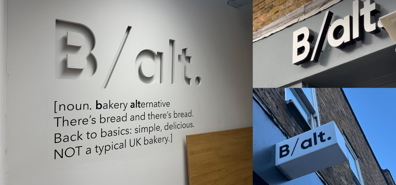
B/alt. simply means Bakery Alternative. Which is exactly what we were setting out to achieve. We wanted to be different to run of the mill high street bakeries and embrace some of the vibe from the hip independent bakeries that have sprung up successfully around London over the last decade. In other words, a combination of the two. We had to keep an eye on the brief that this is a brand that was created to roll-out. We wanted the positive associations that come with a brand – such as consistency and trust – but we wanted the vibrancy and appeal of an edgy smaller ‘guerilla’ bakery.
This thinking manifests through the logo design – very simple and contemporary – through the supporting identity system. The supporting typography is vitally important in ensuring the consistency of the brand across all collateral from packaging through to the design of the physical space. Not to mention how ther brand works online to reinforce the feeling of the physical space.
What we were aiming for was one consistent brand proposition articulated through the brand identity system that can pace up or down depending upon the requirements of the collateral. Whether that’s the interior design, the bags carrying your to go croissant or the Instagram feed that you look at as you drink your coffee.


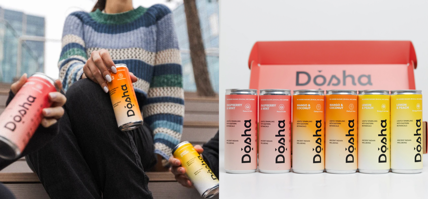
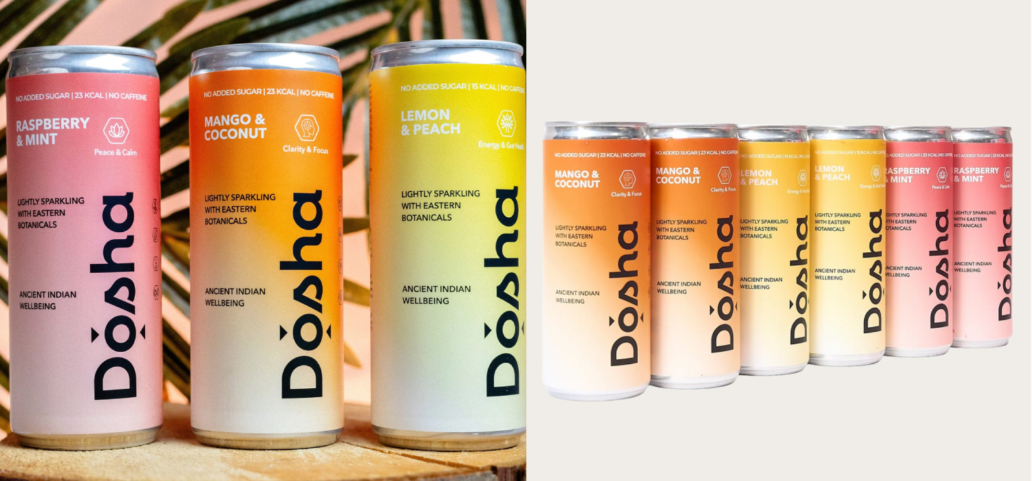
Well, a business must package itself in a way that creates a groundswell of interest and a momentum that makes it impossible to ignore. It needs to articulate a compelling proposition and a lighthouse identity – clearly standing for something and articulating it in a way that really grasps the imagination.
The business thus requires a vehicle that encapsulates the potential of its possibilities and sets the scene – and thus the tone – for it to go out and do business. Something that does the pre-work before the website, or the location is visited. A vehicle that will really stand it apart. It needs to paint a picture in stakeholder’s minds of just what it is that it stands for – and then also engender a trust in what it will actually deliver.
That is about more than creating a logo. It is about building a Brand.
Strong brands have fans rather than customers. People become aware of them and what they stand for without ever looking for them – they take on a momentum all of their own. One person becomes a believer and then tells others. These people become brand evangelists. This is fundamentally what we need to achieve.
Yes, we need to create a stunning logo, but that is just the tip of the iceberg. We must build a powerful identity system around it and then wrap it in a compelling brand story. And most importantly of all we need to build it on the solid foundations of a clear, stated reason for being and a set of values that underpin everything that the brand does.
The more complex the issue, the simpler the solution. You should be able to write the essence of each brand on the palm of your hand. If you can’t it means that you haven’t ‘got it’. And if you haven’t got it no-one else is likely to either – whether that’s customers, media, influencers, investors or employees etc.
Therefore a key measure of success for us in our roles as brand creators is getting the Brand’s essence distilled onto one A4 sheet of paper – a concise, compelling template for the brand – one that will articulate its (four) key constituent elements. This will mean that the business will move forward intrinsically understanding what is right for the brand and what isn’t.
If you’d like to know more get in touch.
Paul Thwaites
Founder, ZUT Brand+Identity
paul@zutalors.design


That was the scenario that faced us when were were approached in our capacity of brand and identity design consultants to the food and beverage sector to create the brand and graphic identity system for a donut start-up brand.
The clients were two Brazilian guys with a small budget to get the whole thing off the ground, but they knew that brand was going to be vitally important to the success of their business start-up.
They told us that they wanted to called it Doughnuty. Which is a good, descriptive name in itself, but one that by itself was hardly going to create the level of stand-out and differentiation that they’d need to ensure success in such a competitive marketplace.
Our view was that we can’t just do a brand with a generic name and a colour scheme from a children’s play school. That was our strategic starting point.
Our first key intervention therefore was to adopt a phonetic approach to the name. The thinking being that if we’re going to be called Doughnuty let’s shorten it to a phonetic acronym – DNT … Dough-nut-y. The second intervention was to ‘own’ a colour – thus bucking the sector trend and creating another element of potential brand differentiation.
The brand identity system that we created was then applied to packaging, point of sale, clothing and online elements such as website and social media posts.
The brand that we created for DNT enjoys massive popularity and a strong online following. Sales are good and the start-up is already looking at expanding.
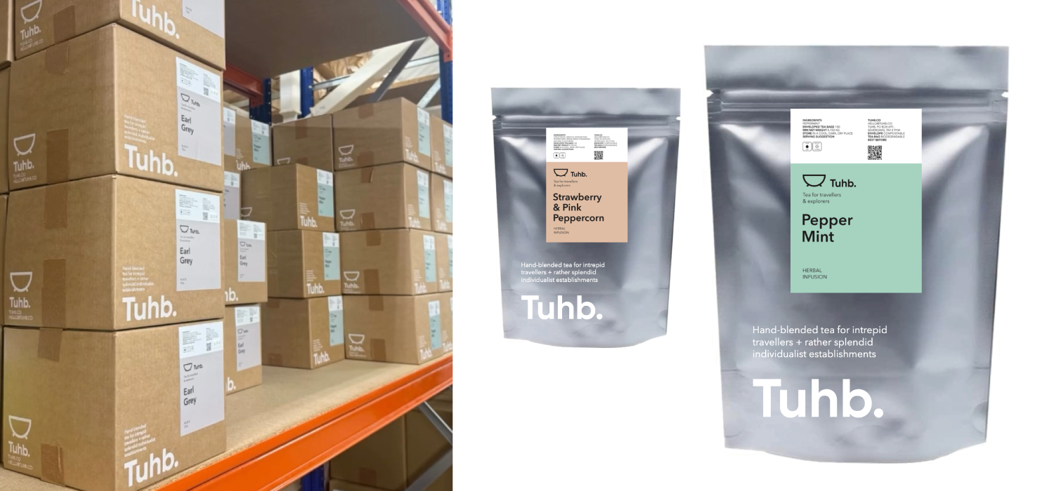
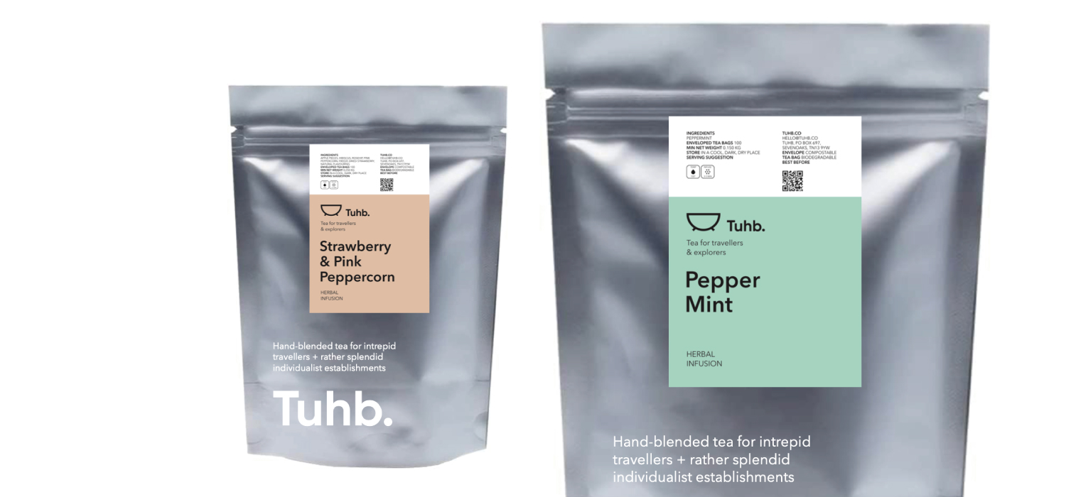
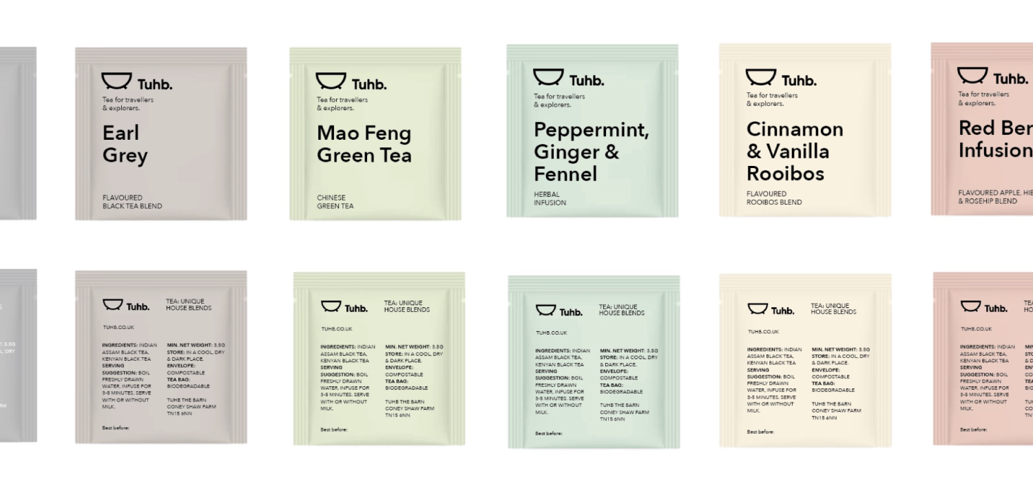
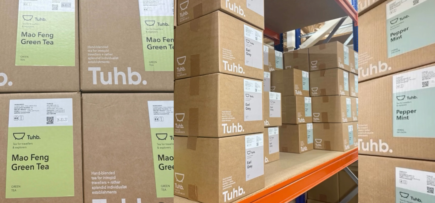
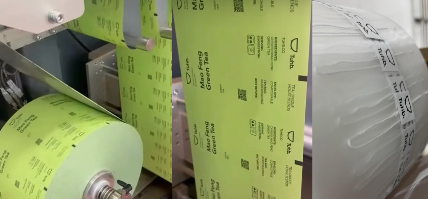
When they wanted to create their own tea brand start-up specifically aimed at the independent boutique hotel sector they came to us in our capacity as a brand identity creation consultancy specialising in the food and beverage sector.
They wanted the product to represent their exploration of the best leaves and their navigation of the long journey from plantation to pot. And that it should also nod to tea’s position as the sustenance of choice for weary travellers throughout the ages.
A strong brand should be rooted in an incisive idea that goes to the heart of its reason for being. This will then drive everything that the business does, not only from a marketing perspective but also from an operational one.
With that in mind we realized that the one common factor shared between its core target independent boutique hotels customers is that they are all likely to have a freestanding bath. Hence our coming up with the name for the brand – Tuhb. Apart from being a subversion of ‘tub’ it’s also an acronym of ‘Tea – Unique House Blends’.
This naming approach fits with a positioning of being a contemporary tea company rather than a traditional one. In effect we were travelling in the opposite direction from most tea companies, who tend to employ traditional and heritage based brand identity cues. Thus, the name lead to the development of the simple tub graphic icon.
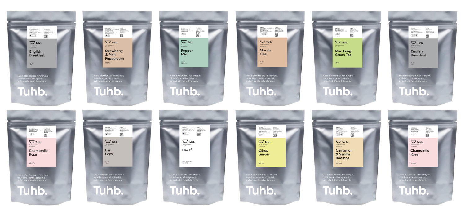
At the other end of the challenge is that they offer multiple tea blends, often in small batches and with new ones being developed all the time. Our packaging design solution is therefore conceived to be flexible in order to allow them to do this – a branded generic pouch concept that is over-layed with colour-differentiated individual labels.


A good example of this is the brand creation work that we did for a street food business called ‘Flette.
The work that we did allows for the brand to comfortably sit in a streetside gazebo at the same time as an upmarket restaurant location, or indeed a supermarket shelf, without feeling over-stretched or compromising its brand values.
The brand identity system that we designed allows for this scalability and covers signage, packaging, clothing, vehicles as well as online design.

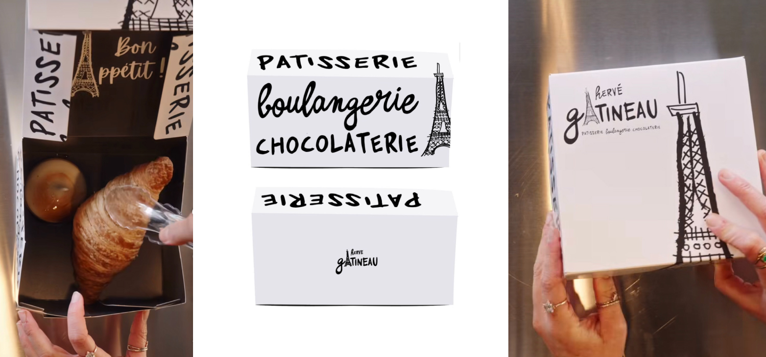
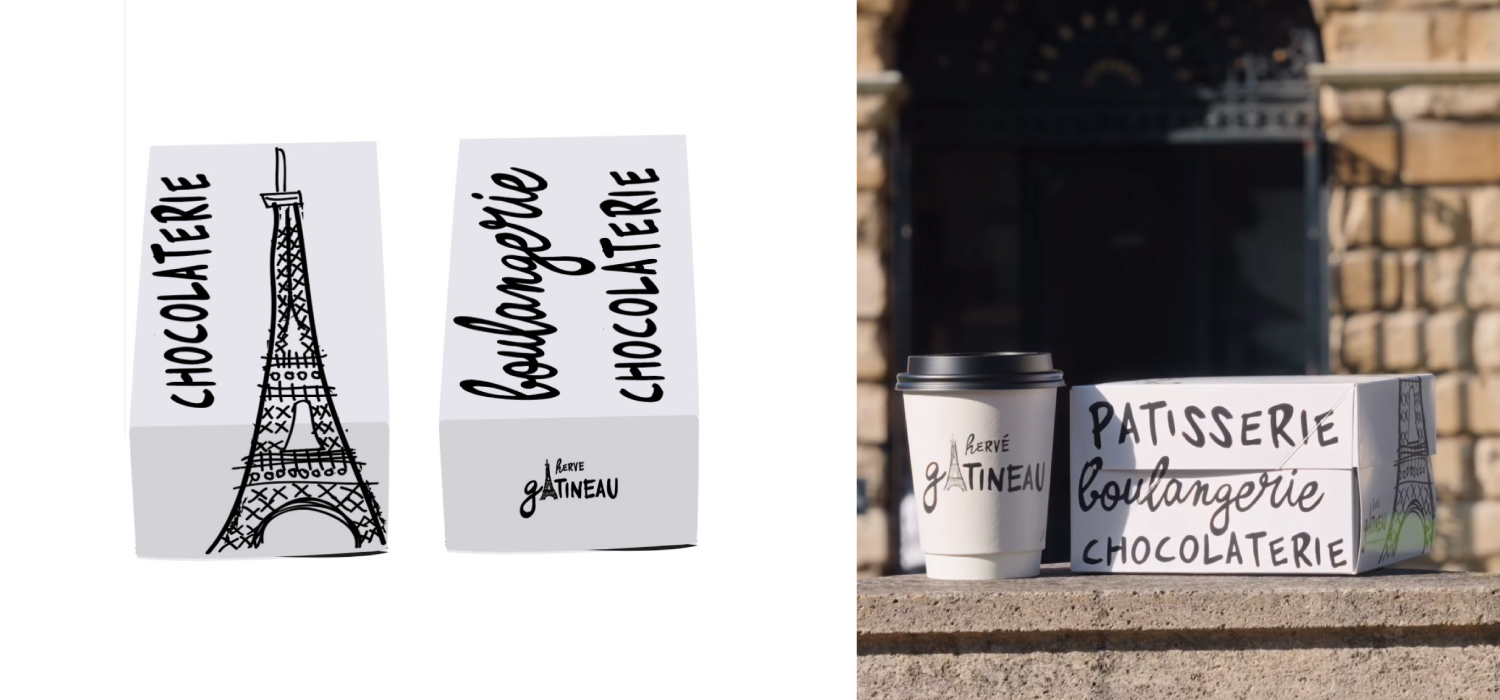
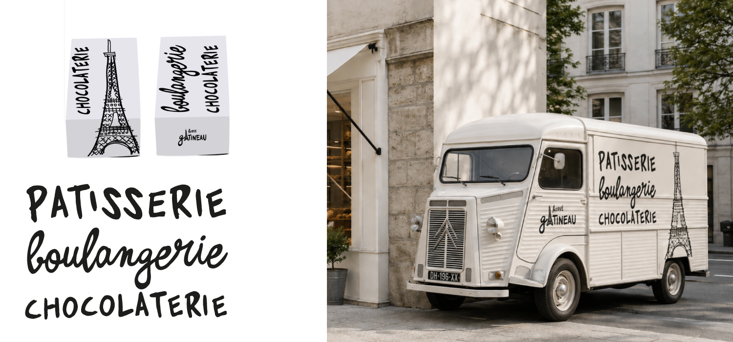
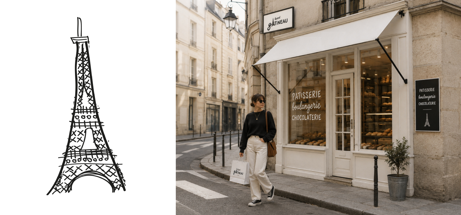


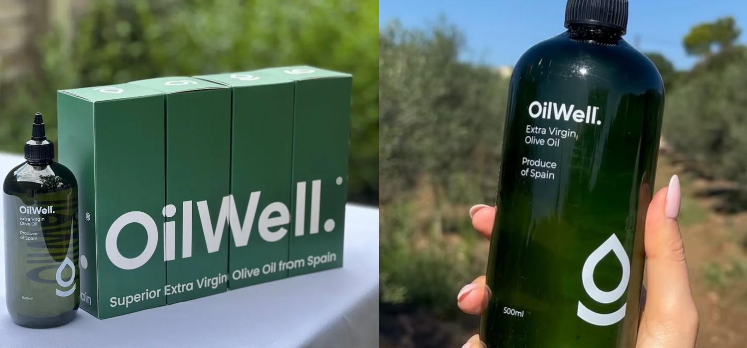
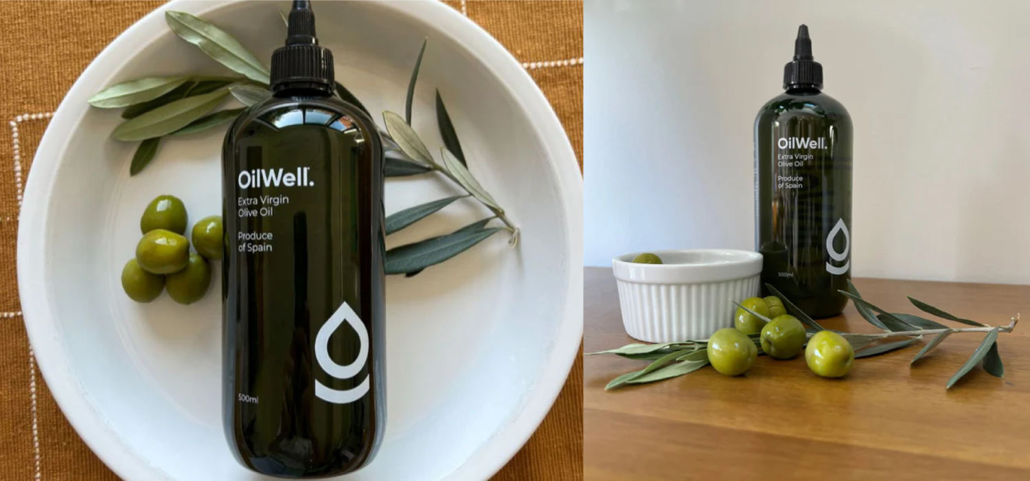
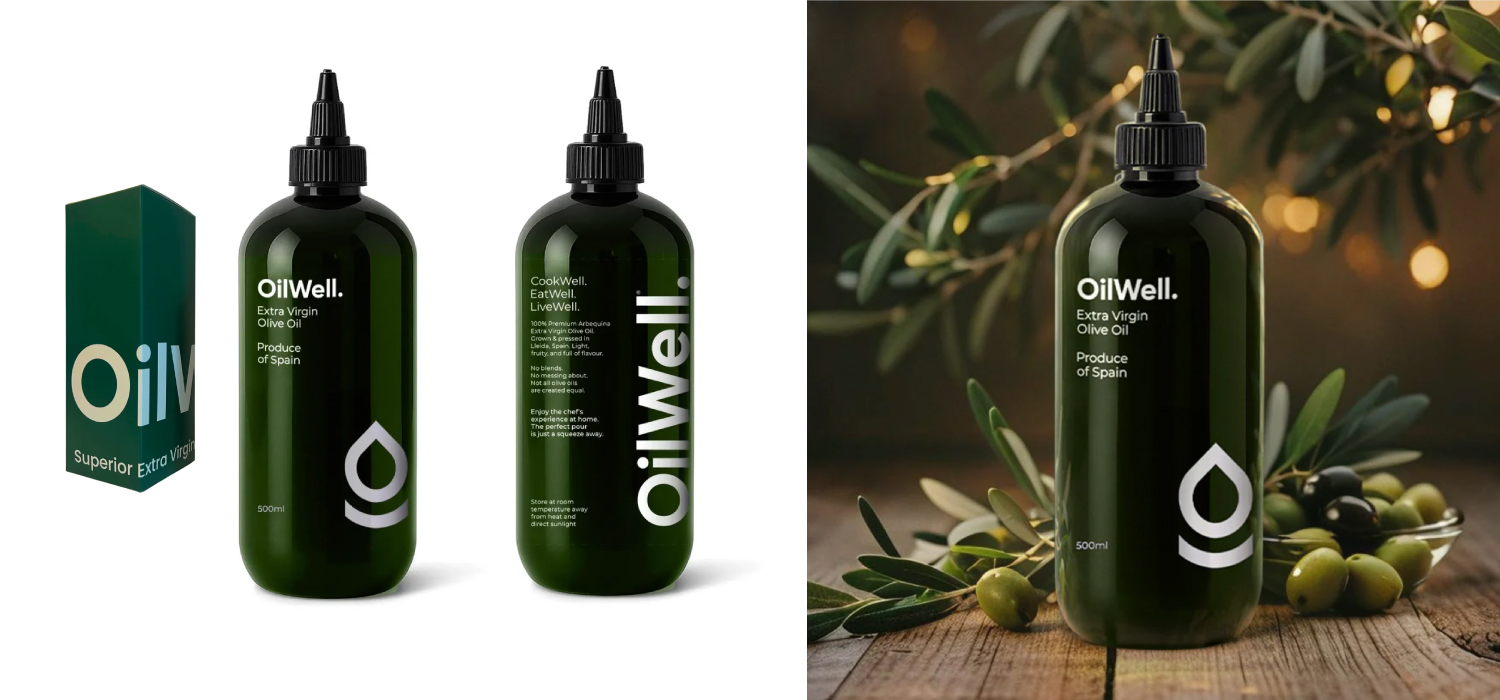

This was the initial challenge when our client approached us – in our capacity as brand creation experts for start-ups in the food and beverage sector – to create their new olive oil brand. In fact they had another name in mind completely: Squeezy – because it was descriptive of its plastic bottle.
We felt that creating a brand around what was after all a generic packaging style, whilst perhaps useful in the short term – when this type of packaging is a novelty in relation to traditional glass bottles – would mean potentially limiting their differentiation in the long term. For example, the marketplace is already starting to adopt this type of packaging – indeed M&S has just brought out a really striking own range olive oil in a vibrant yellow green squeezy bottle.
No, we wanted to go for another naming route entirely. One that would give the new brand both real on-shelf stand-out and would also allude to its brand values.
Oilwell was the name that we came up with as part of our role as brand and identity creation consultants. Both descriptive and with a double meaning word play.
The logo design was kept simple – minimal and contemporary. This would allow the bottle to use simple striking typography rather than additional design elements – such as tertiary level patterns – in order to stand out.
The identity system that we developed was subsequently applied to outer packaging and online applications including website and social media.
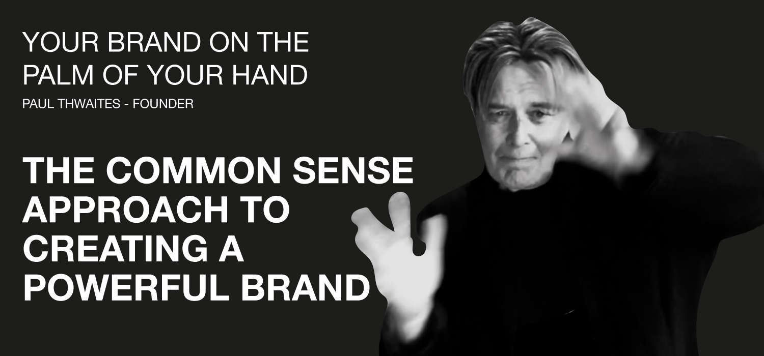
You’ve got a big idea and a potentially great product – you know it will fly if you could just get people as enthused about it as you are. Therefore, based on the adage that a strong brand is built on an engaging proposition backed up by a great experience, you’ve got exactly half of what you need for success. What you don’t have is the stunning brand proposition.
You know that you need to tackle the dreaded B word but where to start? Money’s tight and one thing you know for sure is that at this early stage in the growth of your business you can’t afford a big consultancy. If that’s the case and you’d like to know more please get in touch…
Paul Thwaites
Founder, ZUT Brand+Identity
paul@zutalors.design


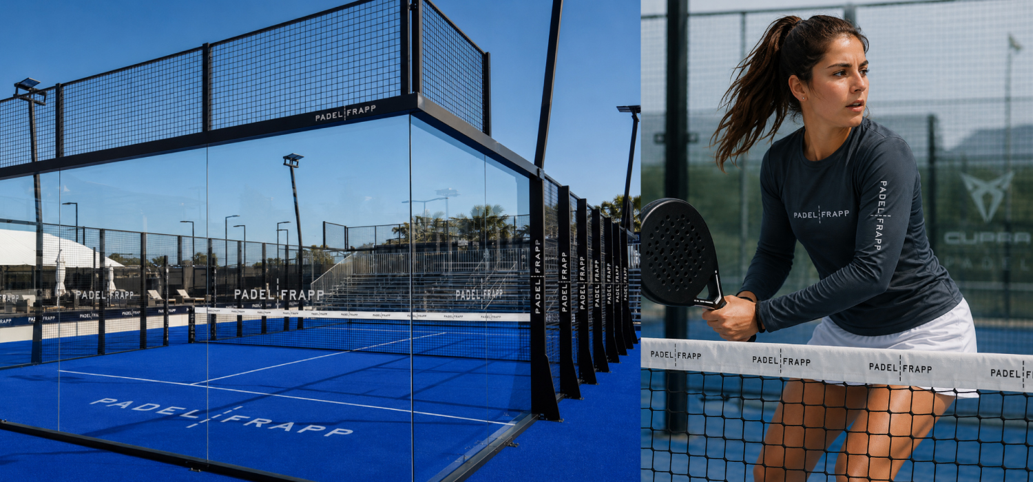

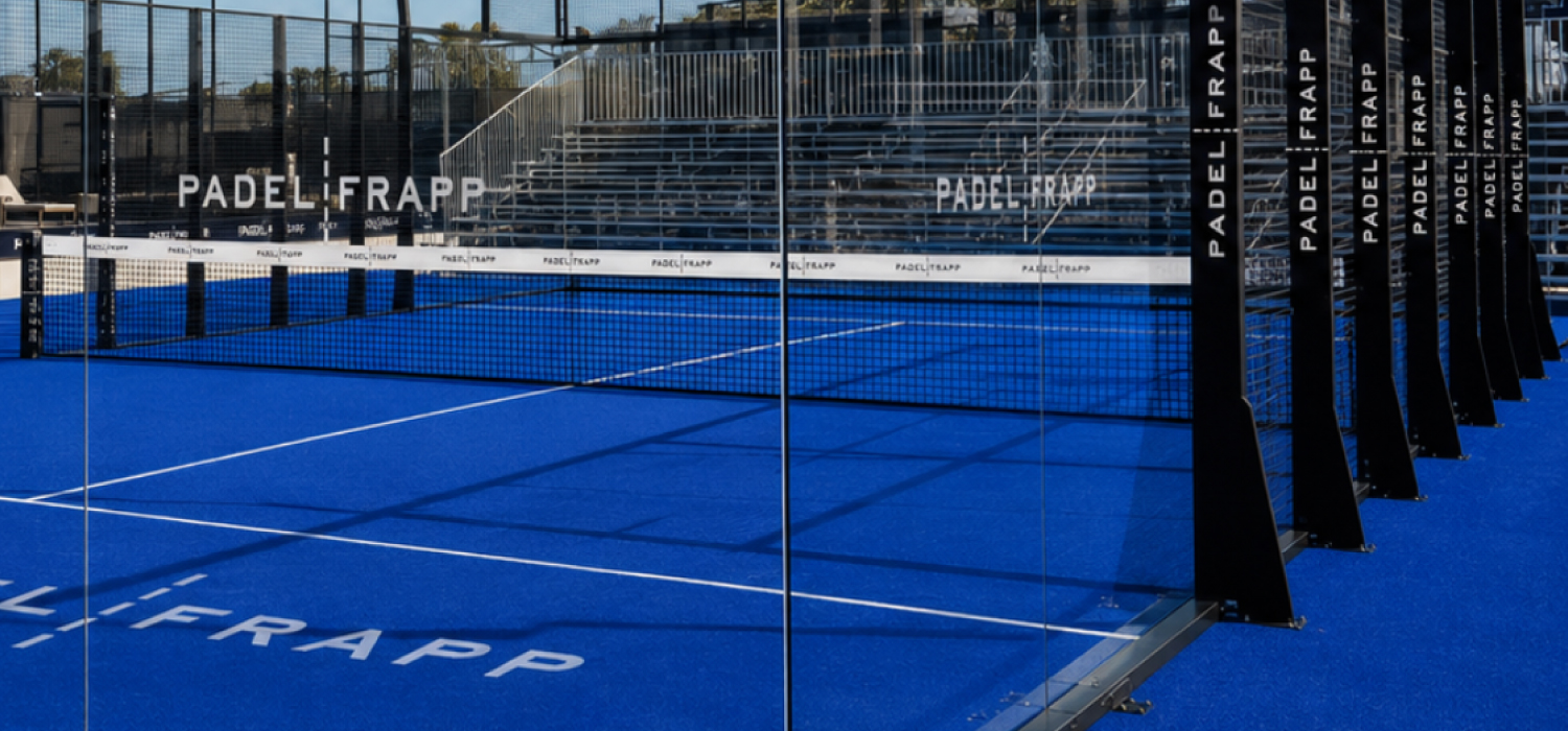


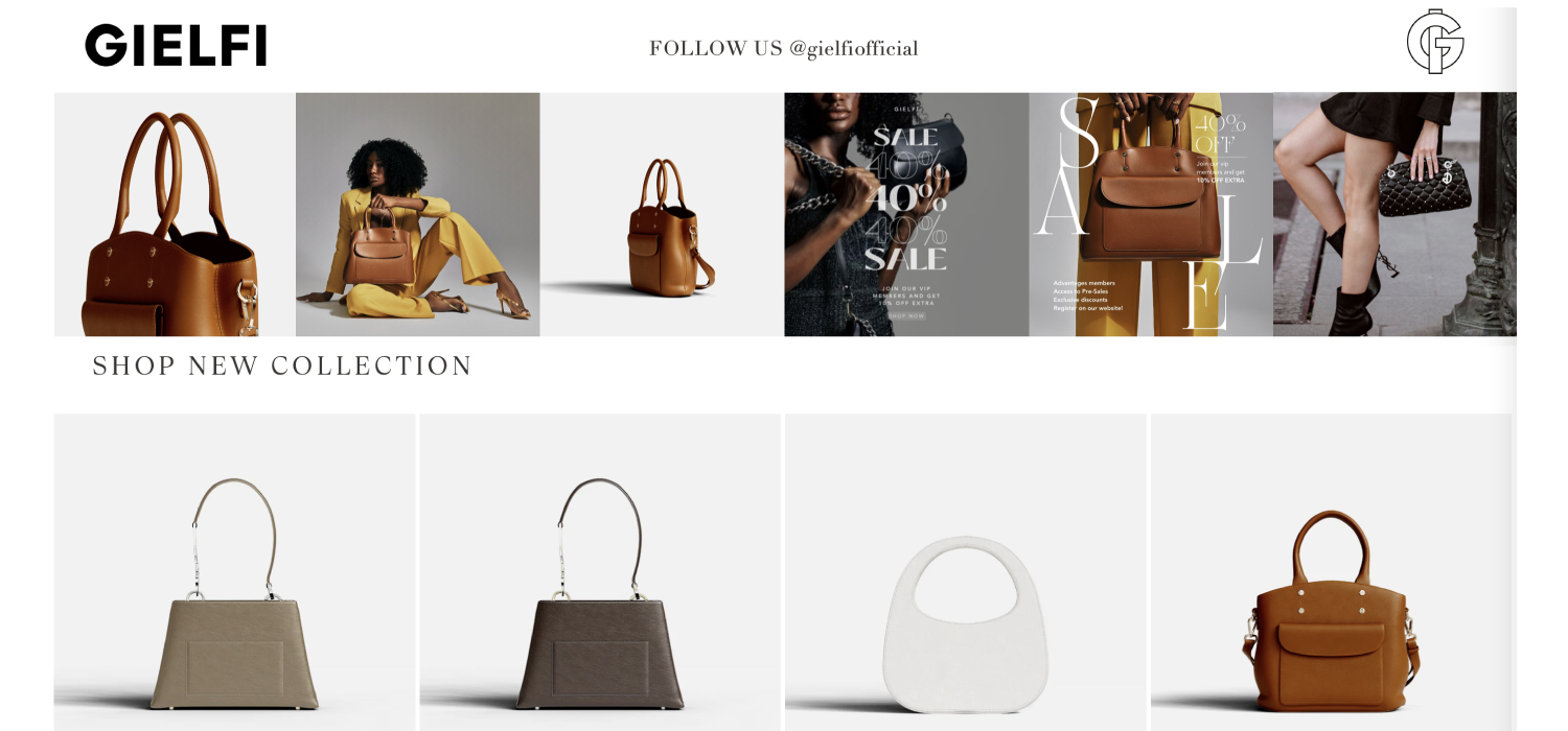

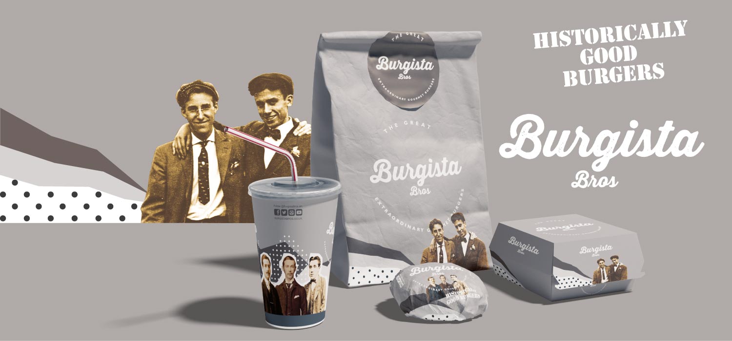
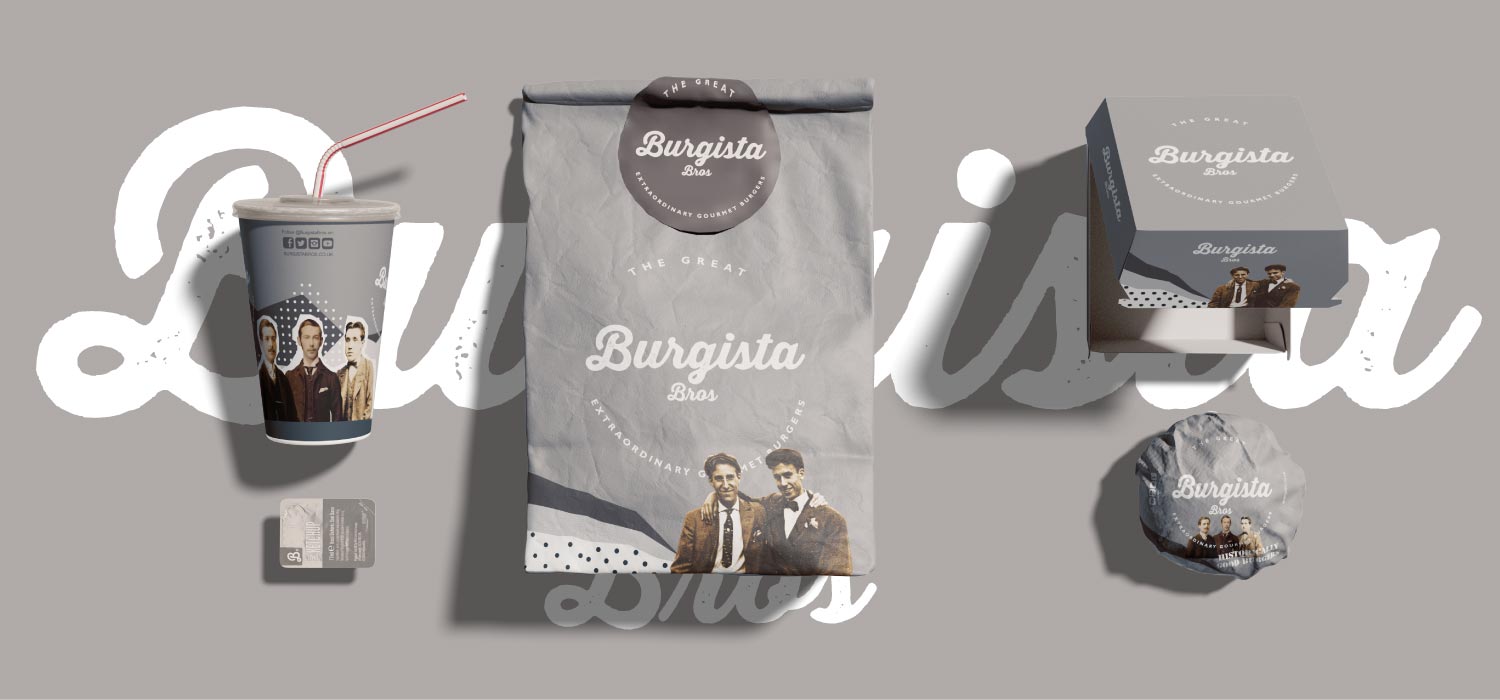
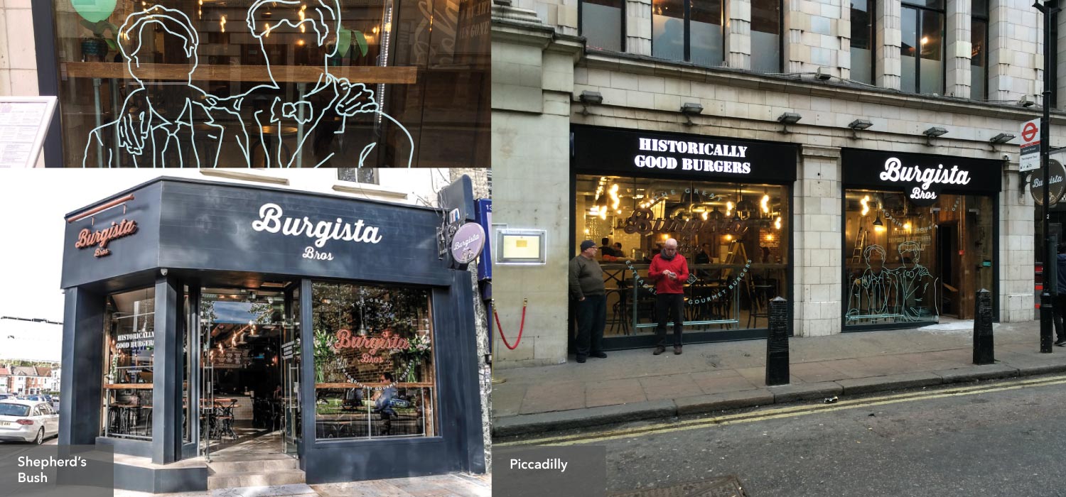

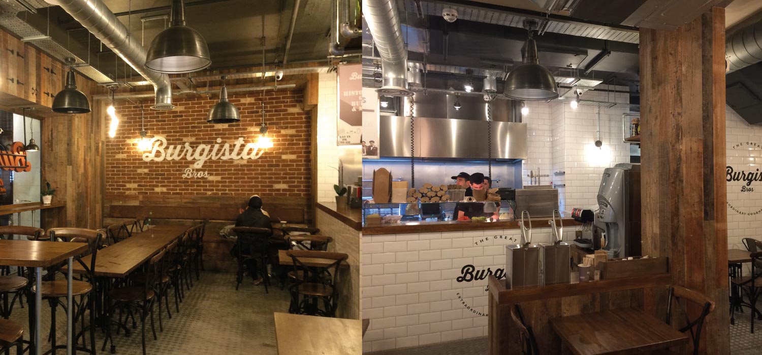
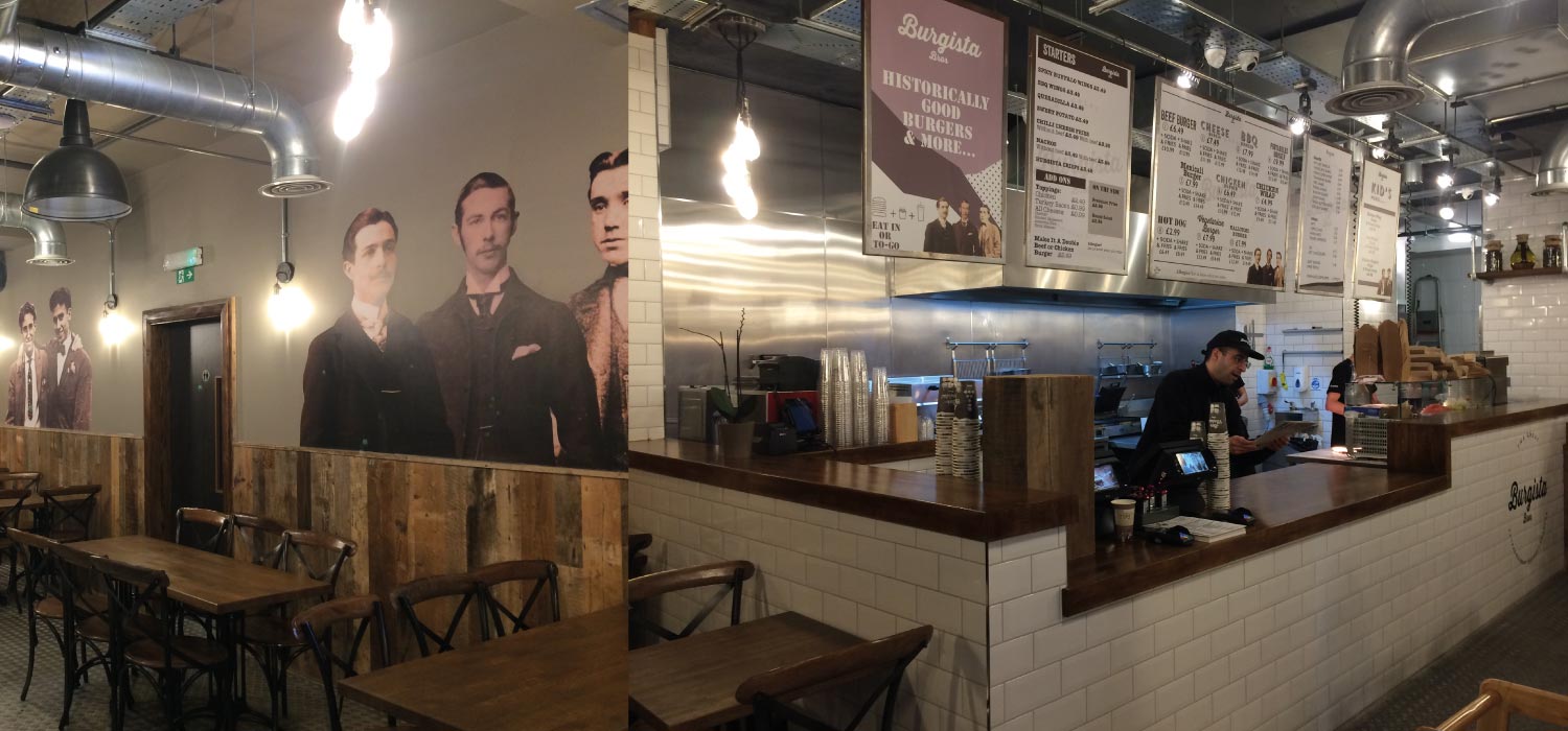
We always say that we make our clients look like they’ve spent £100k when in fact they’ve only spent a fraction of that.
If you’re in the process of thinking about your brand and you’d like to know more please get in touch.
paul@zutalors.design