Brand Creation: Brand Naming / Brand Definition / Brand Positioning / Brand Tone & Language / Brand Identity: Logotype Wordmark, Graphic Icon, Definition Of Photo Image Style, Typography, Supporting Iconography + Formalisation Into Brand Style Guides.
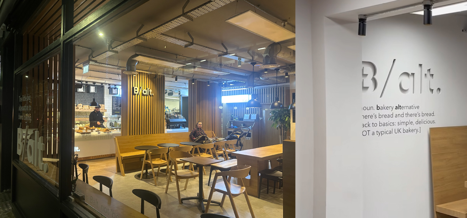
Also Interior Design, Furniture Design, Lighting Design.
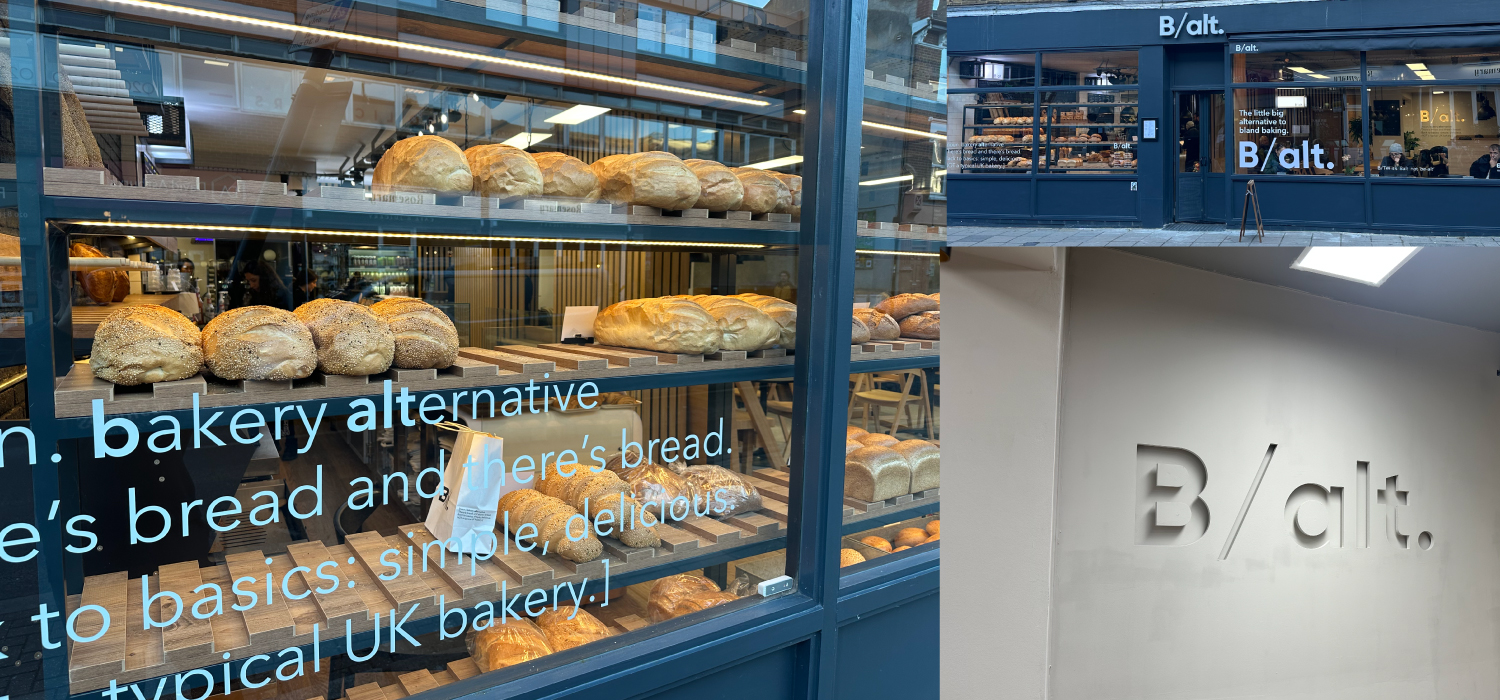



How do you launch a new coffee and bakery into the crowded London foodie sector? That was the challenge that we faced in early 2025 when, in our capacity as a brand creation design consultancy specialising in the food and beverage sector, we were asked to create the brand and identity for B/alt Bakeries.
The client wanted to utilize the benefits of a central bakery and create the platform to roll-out multiple outlets around London’s Zone 2 & 3 – it’s affluent London villages outside of the West End: Marylebone, Primrose Hill, Hampstead, Barnes etc. In other words where people actually live. The target audience was therefore very brand literate and sophisticated in their likes. They’re also quite open minded to the next new thing. That is, as long as it is authentic. The London foodie sector can spot a fake a mile off.
You have one opportunity to make a big impression and equally one chance to screw it up if you don’t deliver. In other words it’s not enough to simply come up with a nice brand concept – you actually have to deliver in terms of the product and the service. If these elements aren’t all equally strong then a brand will not survive in such a competitive arena.
We started our brand with a white sheet of paper.
The first thing that we created was the brand name. We wanted to articulate a contemporary feel through the brand that would reflect the bakery’s approach to its products: traditional values but meeting the wants of a sophisticated London customer with contemporary tastes.
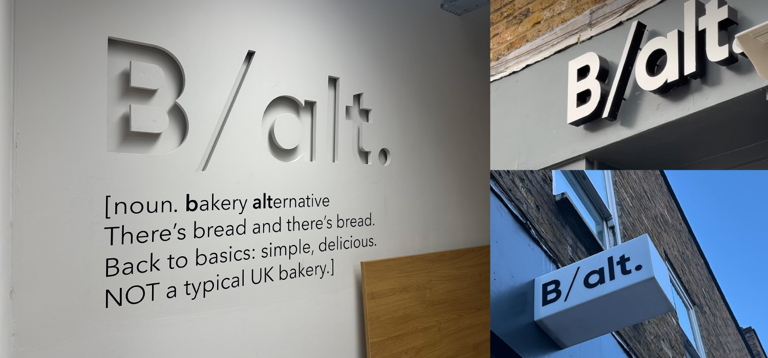
B/alt. simply means Bakery Alternative. Which is exactly what we were setting out to achieve. We wanted to be different to run of the mill high street bakeries and embrace some of the vibe from the hip independent bakeries that have sprung up successfully around London over the last decade. In other words, a combination of the two. We had to keep an eye on the brief that this is a brand that was created to roll-out. We wanted the positive associations that come with a brand – such as consistency and trust – but we wanted the vibrancy and appeal of an edgy smaller ‘guerilla’ bakery.
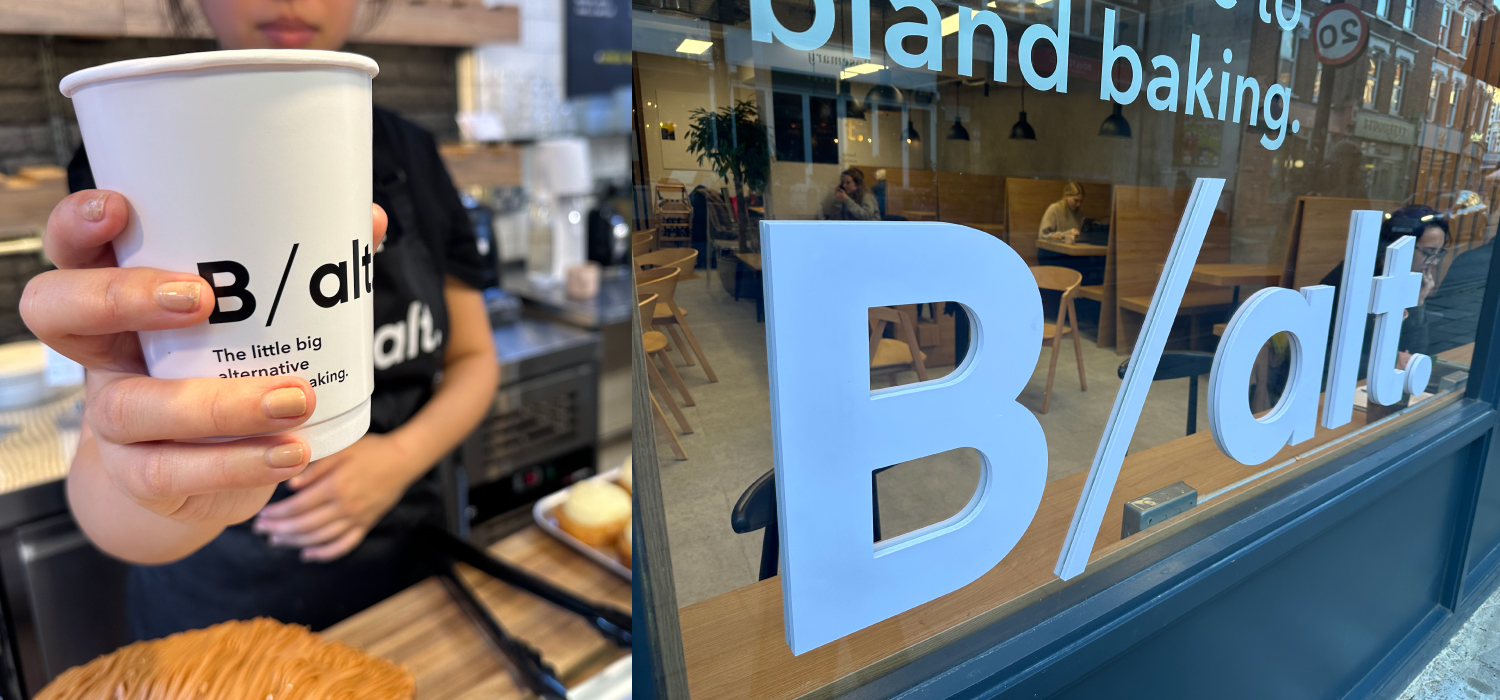
This thinking manifests through the logo design – very simple and contemporary – through the supporting identity system. The supporting typography is vitally important in ensuring the consistency of the brand across all collateral from packaging through to the design of the physical space. Not to mention how ther brand works online to reinforce the feeling of the physical space.
What we were aiming for was one consistent brand proposition articulated through the brand identity system that can pace up or down depending upon the requirements of the collateral. Whether that’s the interior design, the bags carrying your to go croissant or the Instagram feed that you look at as you drink your coffee.