
Brand Creation: Brand Definition / Brand Positioning / Brand Tone & Language / Brand Identity / Restaurant Design / Packaging Design + Formalisation Into Brand Style Guides.
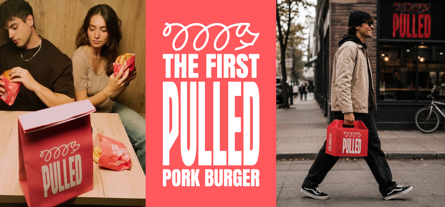
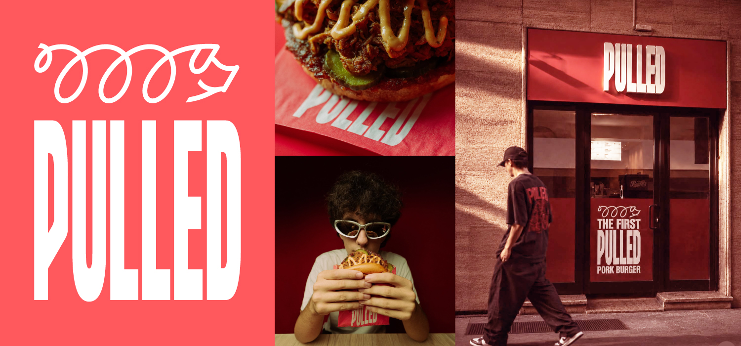
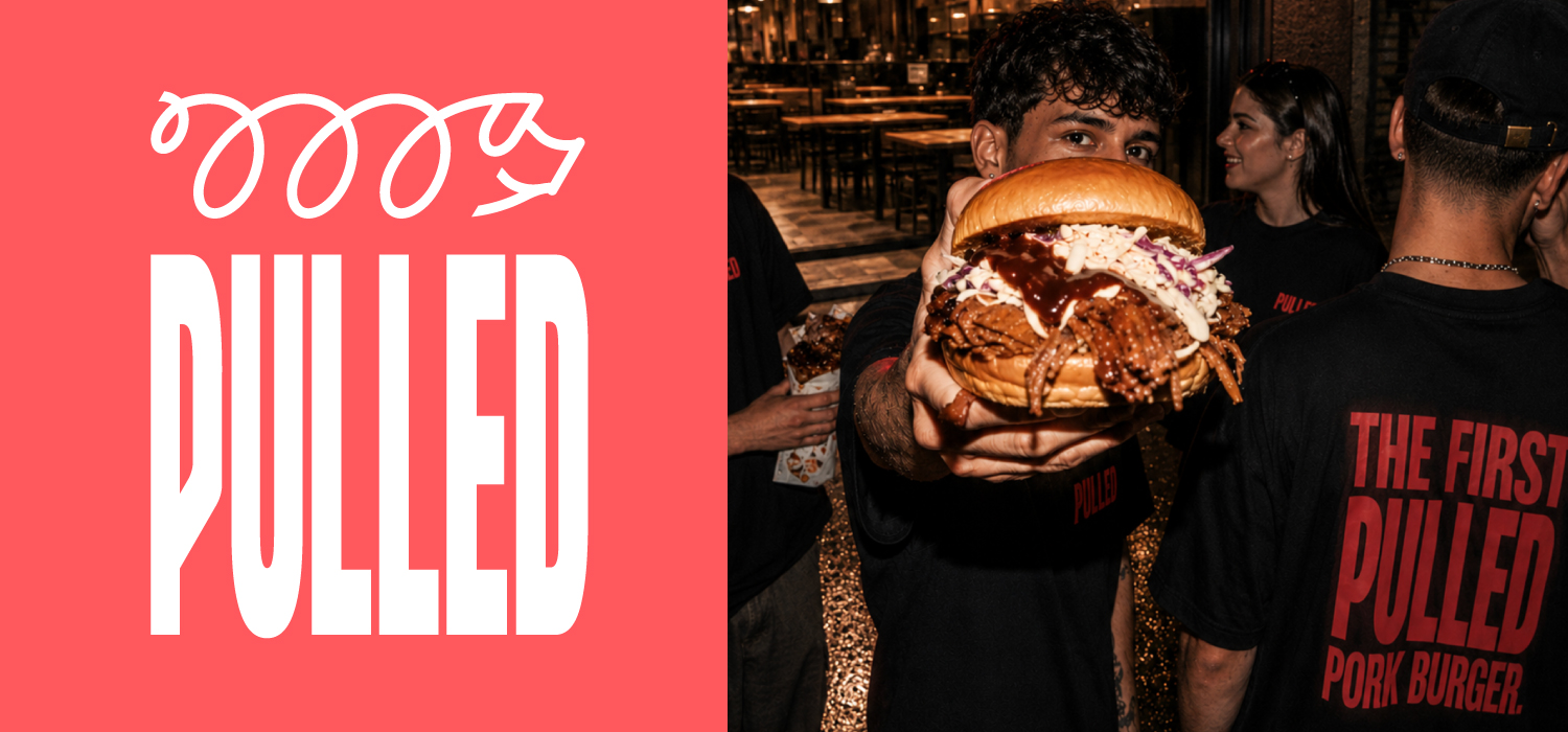
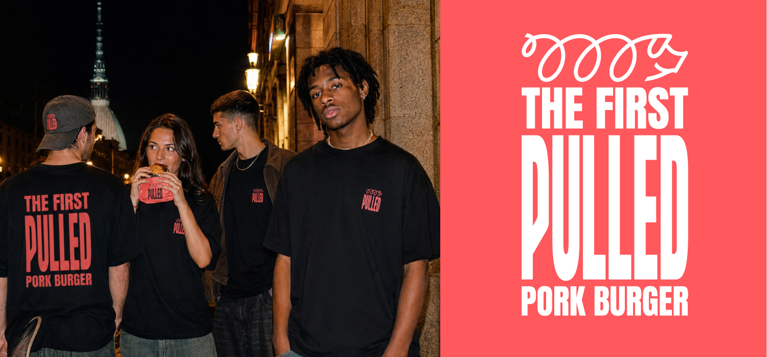
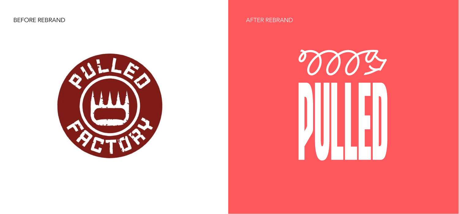
The brand creation brief for this project was to take an existing sit-down restaurant business called Pulled Factory in Turin which was selling a range of Pulled Pork based dishes and package it in a way that would turn it into a Brand (with a capital B) that could roll-out across northern Italy.
Part of that brief was to reposition it towards a younger core demographic. University students being a particular important audience.
The Solution
Pulled came to us due to our specialism in brand identity creation for brand start-ups in the food and beverage sector. We worked together to define a solution that involved not only the way that it is presented but also the product itself. The menu was significantly simplified: down to to two core products, priced competitively and pitched in a street food to-go style.
This is classic vertical sectoring. In other words, we set out to become ‘the place for pulled pork street food in northern Italy’.
To reinforce this proposition we shortened the name from Pulled Factory to simply Pulled and we introduced a logotype that reflects the combed pulling sequence that is used to create the product. We combined it with a striking colour, thus ensuring category ownership moving forward, plus high visibility on street: both in terms of shop frontages and also the packaging. Finally we developed the ‘Squiggle-Piggy’ icon to bring in additional personality to the brand.
Thus Pulled employs a triumvirate of core brand identity elements: wordmark, colour and icon.
Food bags were designed purposely as part of the brand advertising & influencing programme – to be carried around the streets of Turin and Milan and into university campuses by its hip young customers. This is backed up by an integrated ongoing social media campaign.
The key elements of the brand programme that we created for Pulled can thus be broken down into two areas. Firstly, the brand’s strategic proposition – brand vision & mission; brand tone & story; brand identity. Secondly, the brand’s tactical implementation programme – which covered design of packaging & branded clothing, store design and also the overall look and feel for its online presence (both social media and website).
A simple photoshoot was also undertaken – using real customers – in order to bring all the brand elements to life: in a real, urban, street food style that reinforces the authenticity of both the brand and the product.